Module 2 introduced the grammar of matplotlib. This module introduces the vocabulary: the plot types that come up repeatedly, their key arguments, and the situations where each one is the right tool.
Think of this module as a phrasebook.
┌─────────────────────────────────────────────────────────┐
│ FAMILY 1: 1D / relational                              │
│ plot, scatter — relationships between two variables     │
├─────────────────────────────────────────────────────────┤
│ FAMILY 2: distributional / categorical                  │
│ bar, hist, boxplot, violinplot — shape of data          │
├─────────────────────────────────────────────────────────┤
│ FAMILY 3: 2D / image-like                               │
│ imshow, contour, contourf, pcolormesh — gridded data    │
│ This family matters especially for radiology work.      │
└─────────────────────────────────────────────────────────┘
4.1 Family 1 — Relational plots
Relational plots show relationships between variables, usually two 1D arrays: x and y.
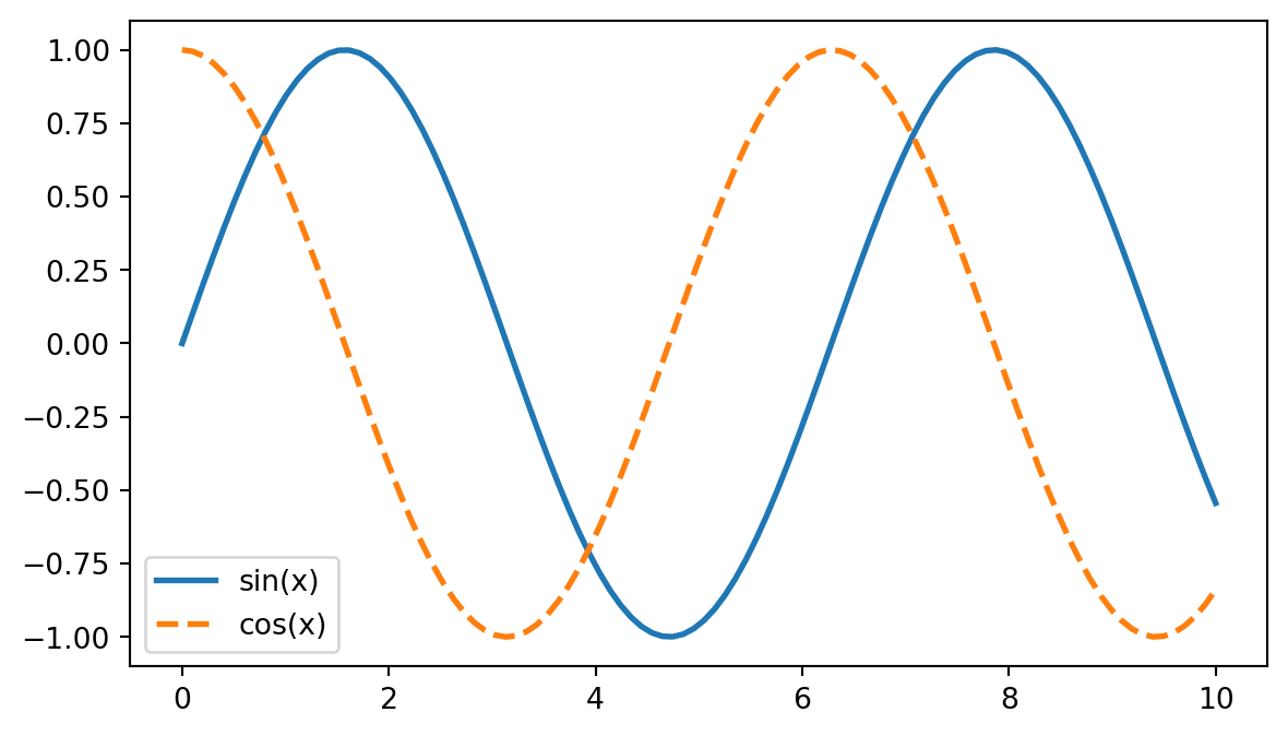
4.2ax.plot(x, y): line plots
ax.plot() is the default workhorse. It connects points in the order given.
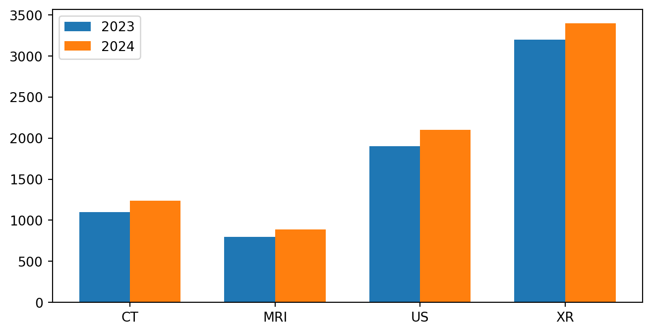
This is one of the places where ggplot2 would be more automatic with dodging. In matplotlib, the offsets are explicit. Seaborn can handle this more directly.
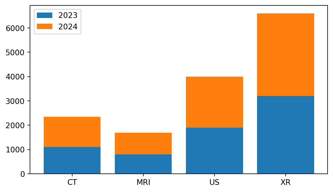
Stacked bars use bottom= to stack one series on top of another:
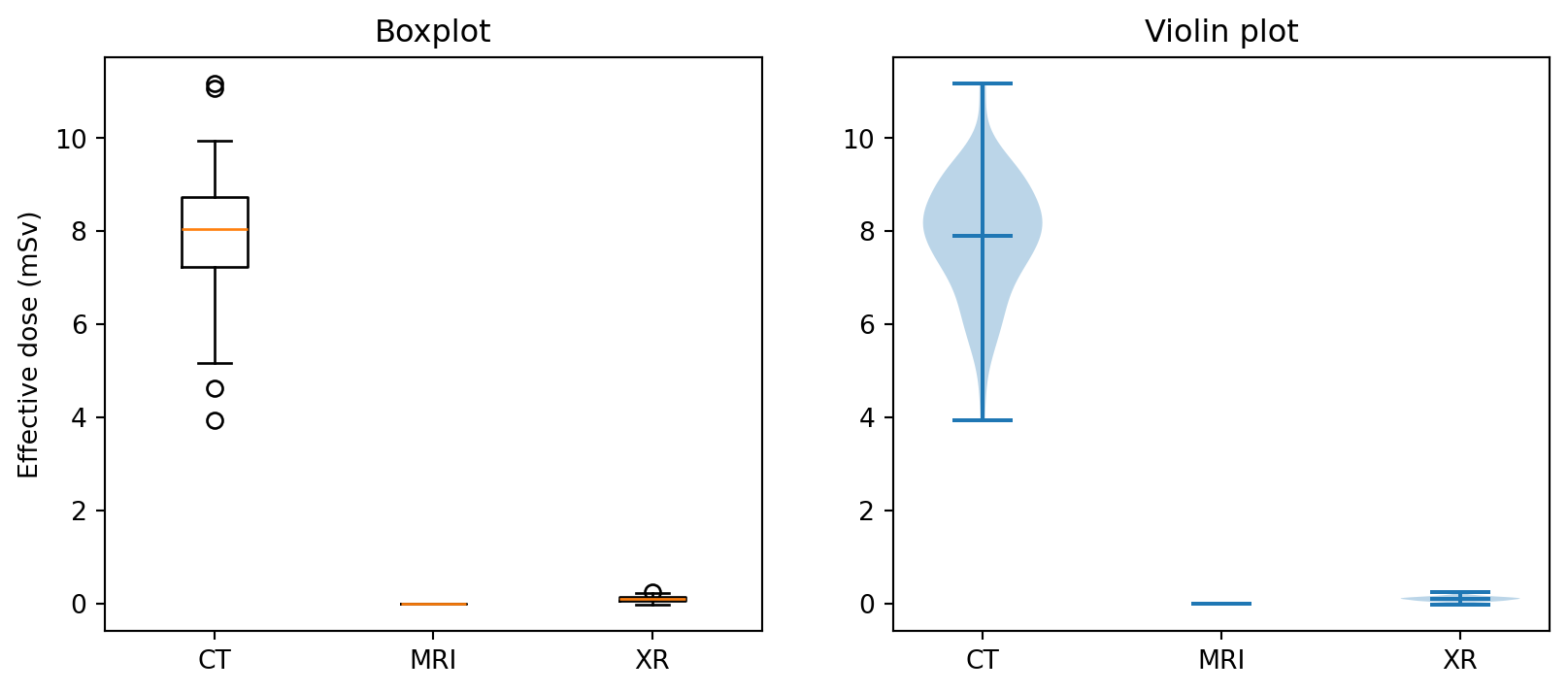
Boxplots summarize distributions with a small number of statistics. Violin plots show more of the density shape. Violins are helpful for multimodal data; boxplots are better when quartiles need to be read directly.
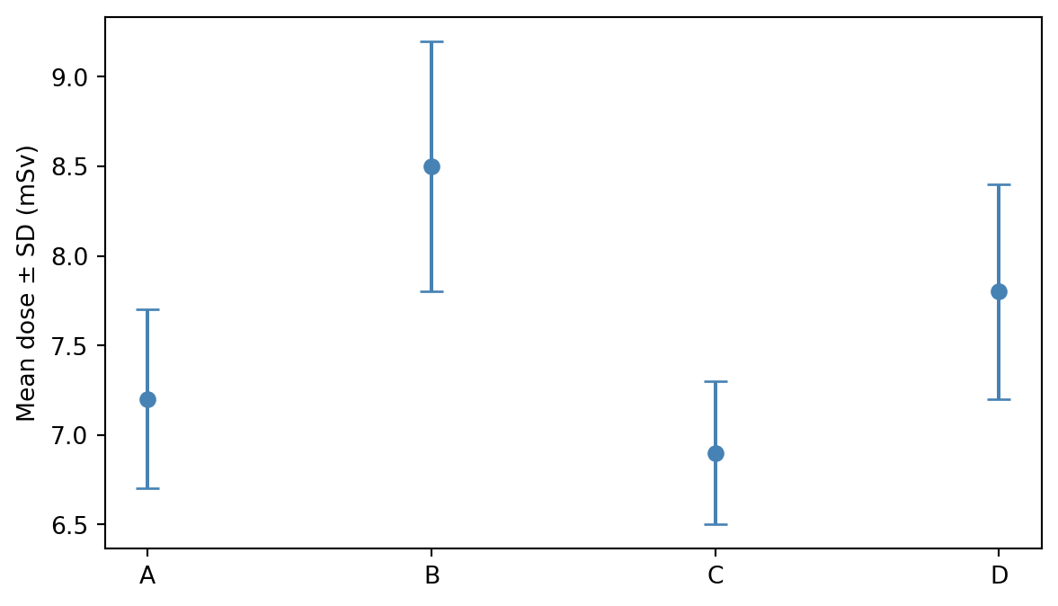
4.8ax.errorbar(x, y, yerr=...): points with uncertainty
Error bars are common for values like mean dose ± SD across scanners.
fmt="o" means circle markers without a connecting line. fmt="o-" would connect the points. capsize= controls the width of the small T-bars at the ends of the error bars.
4.9 Family 3 — 2D and image-like plots
This is the most important family for radiology work. Images are fundamentally 2D arrays of numbers.
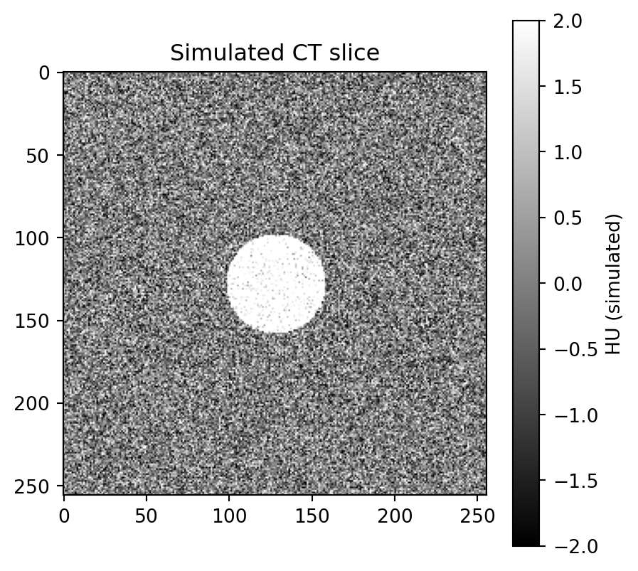
4.10ax.imshow(array_2d): display a 2D array as an image
imshow() displays a CT slice, MRI slice, photograph, heatmap, or any regular 2D matrix.
cmap: colormap name. For radiology, common choices include "gray" or "bone"; for functional or heatmap data, "viridis" is often a good default.
vmin, vmax: data values mapped to the darkest and brightest colors. This is the matplotlib equivalent of windowing. For real HU data, vmin=-1000, vmax=400 approximates a lung window.
aspect="equal": preserves square pixels; this is the default.
aspect="auto": useful for non-spatial 2D data such as spectrograms.
origin: imshow() places row 0 at the top by default, following image convention. Use origin="lower" for mathematical 2D functions.
imshow origin
─────────────────────────────────────────────
origin="upper" (default)          origin="lower"
row 0 → ┌─────────┐               row N → ┌─────────┐
        │ pixel   │                       │ pixel   │
row N → └─────────┘               row 0 → └─────────┘

For DICOM and most images, keep the default.
For mathematical 2D functions, use origin="lower".
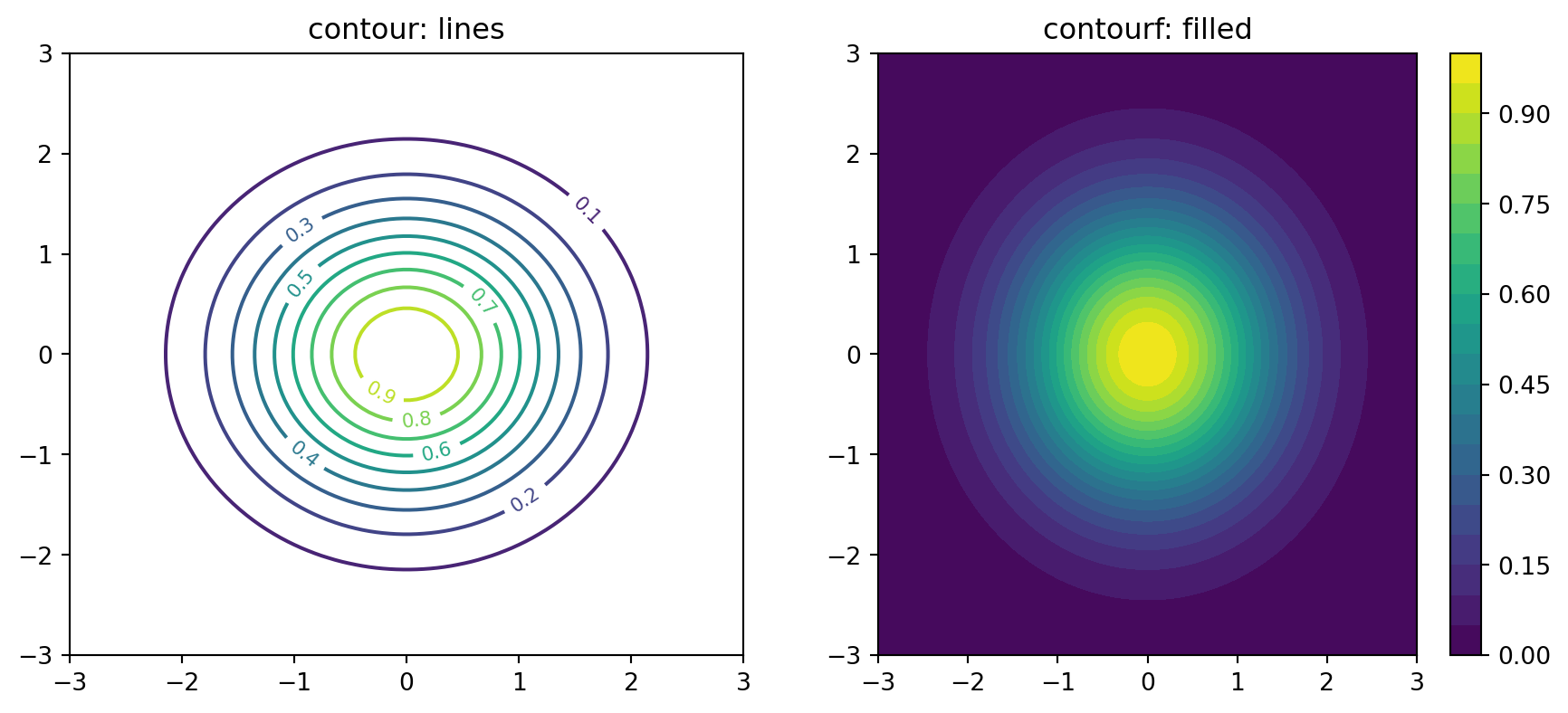
4.11ax.contour() and ax.contourf(): contour plots
Contour plots visualize 2D scalar fields with iso-value lines, similar to topographic maps.
x = np.linspace(-3, 3, 100)y = np.linspace(-3, 3, 100)X, Y = np.meshgrid(x, y)Z = np.exp(-(X **2+ Y **2) /2) # 2D Gaussianfig, axes = plt.subplots(1, 2, figsize=(11, 4.5))# Line contourscs = axes[0].contour(X, Y, Z, levels=10, cmap="viridis")axes[0].clabel(cs, inline=True, fontsize=8)axes[0].set_title("contour: lines")# Filled contourscs2 = axes[1].contourf(X, Y, Z, levels=20, cmap="viridis")fig.colorbar(cs2, ax=axes[1])axes[1].set_title("contourf: filled")plt.show()
The np.meshgrid() step is required because contour plots expect 2D grids of x and y coordinates, not just 1D ranges.
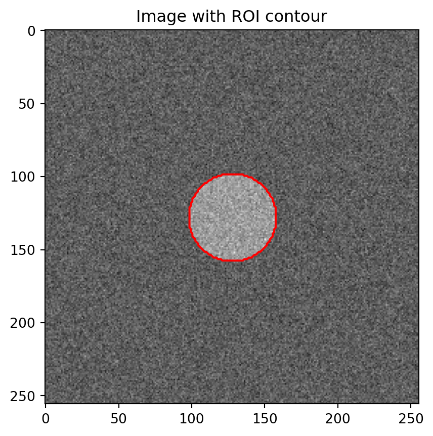
A common radiology pattern is imshow() for the image plus contour() for an ROI overlay:
fig, ax = plt.subplots(figsize=(5, 5))ax.imshow(slice_2d, cmap="gray")ax.contour(mask, levels=[0.5], colors="red", linewidths=1.5)ax.set_title("Image with ROI contour")plt.show()
This overlay pattern appears often enough in radiology that it deserves deeper treatment later.
4.12ax.pcolormesh(X, Y, Z): heatmap on an arbitrary grid
imshow() assumes pixels are evenly spaced. pcolormesh() lets the grid coordinates be explicit, which is useful for non-uniform spacing such as log-spaced frequencies or geographic projections.
imshow vs pcolormesh vs contour
─────────────────────────────────────────────
imshow     → pixels are uniform and square
             CT/MRI slices, photographs

pcolormesh → irregular grid or non-uniform spacing
             log axes, geographic maps

contour(f) → iso-value boundaries matter more than per-pixel intensity
4.13 Decision flowchart
What does your data look like?
│
├─ Two 1D arrays (x, y)?
│ ├─ Ordered / time series? → ax.plot
│ ├─ Independent points? → ax.scatter
│ └─ Points with uncertainty? → ax.errorbar
│
├─ One 1D array (a sample)?
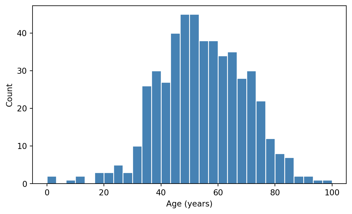
│ ├─ Want distribution shape? → ax.hist
│ └─ Compare distributions? → ax.boxplot / ax.violinplot
│
├─ Categories + numbers?
│ └─ Heights per category → ax.bar / ax.barh
│
└─ A 2D array (image, matrix)?
├─ Display as image → ax.imshow
├─ Iso-value structure → ax.contour / ax.contourf
└─ Irregular grid → ax.pcolormesh
4.14 Exercises
4.14.1 Exercise 1
Generate 200 points where x ~ Uniform(0, 10) and y = 2*x + Normal(0, 2). Make a scatter plot, then overlay the line y = 2*x on top using ax.plot. Use different colors and a legend.
4.14.2 Exercise 2
Take three samples of size 100:
Normal(0, 1)
Normal(0, 2)
Normal(2, 1)
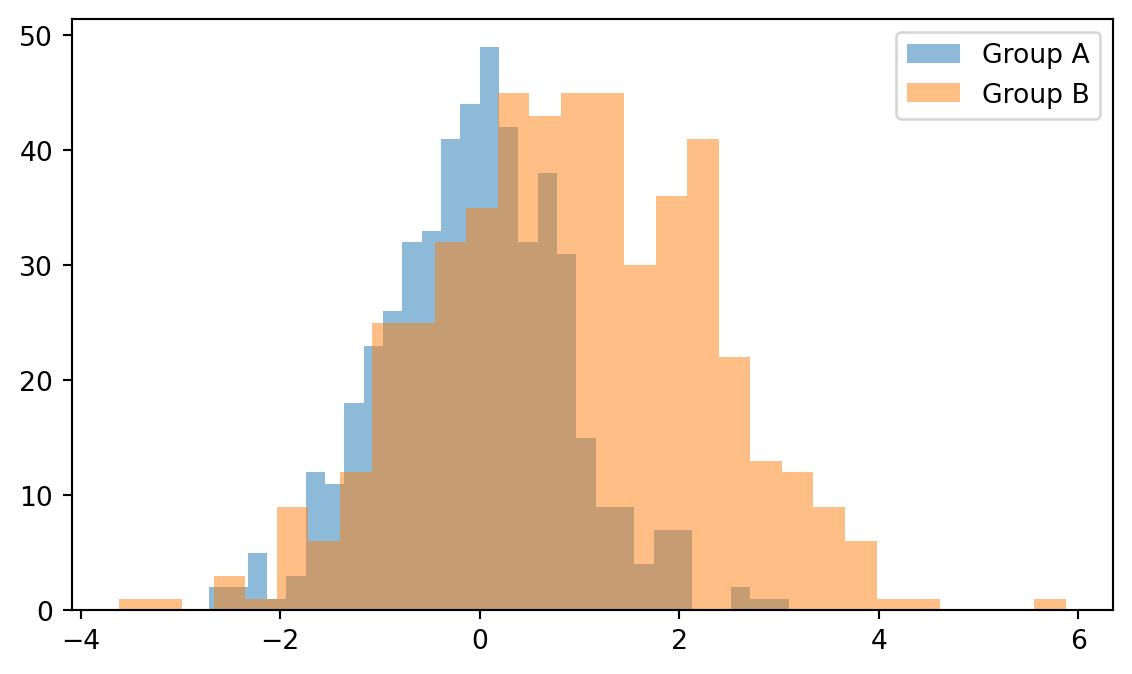
Make a single figure with overlaid histograms using alpha=0.5. Add a legend.
4.14.3 Exercise 3
Create a 128×128 NumPy array initialized to zero, then add a tumor-like circular region: values inside a circle of radius 20 centered at (64, 64) should be set to 1.0, with Gaussian noise added everywhere.
Display it with imshow(cmap="gray"), then overlay a red contour line at level 0.5 to mark the tumor boundary.
4.14.4 Exercise 4
Compute Z = sin(X) * cos(Y) over X, Y ∈ [-π, π] using np.meshgrid.
Make a side-by-side figure:
filled contour plot on the left
imshow() of the same array on the right
Notice how imshow() flips the y-axis by default because origin="upper".