Plots are now possible. This module is about making them readable, polished, and publication-ready.
Coming from ggplot2, this corresponds roughly to knowledge around theme(), scale_*(), labs(), and annotate(), but matplotlib splits those ideas across many small ax.* methods rather than one composable theme system.
The mental model:
┌──────────────────────────────────────────────────────┐
│ An Axes is a collection of customizable parts. │
│ You modify each part by calling a method on `ax`. │
└──────────────────────────────────────────────────────┘
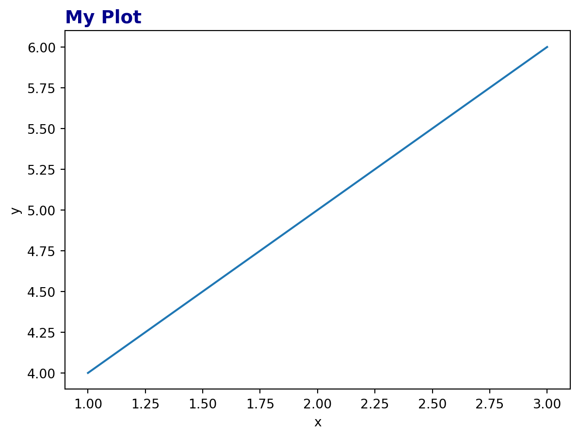
┌──── title ────┐
│ My Plot │ ax.set_title()
│ │
spines ───→ │ ▲ │ ←── spines: ax.spines[...]
(the box) │ │ • • │
│ │ • • • │
│ │ • │ ←── annotations / text:
│ └─────► │ ax.annotate(), ax.text()
│ ↑ ↑ │
│ ticks │ │ ax.set_xticks()
│ │ │
│ x-label │ │ ax.set_xlabel()
└───────────────┘
y-label: ax.set_ylabel()
The customizations below follow roughly the order they are usually added to a plot.
5.1 1. Titles, labels, and basic text
The basic text methods are used constantly:
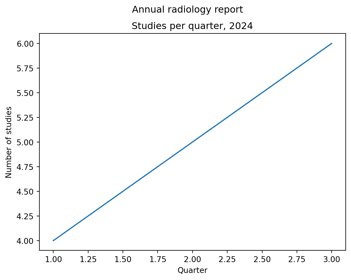
import matplotlib.pyplot as pltfig, ax = plt.subplots()ax.plot([1, 2, 3], [4, 5, 6])ax.set_title("Studies per quarter, 2024") # title above this axesax.set_xlabel("Quarter") # x-axis labelax.set_ylabel("Number of studies") # y-axis labelfig.suptitle("Annual radiology report") # title above the whole figureplt.show()
The distinction matters:
ax.set_title() titles one panel.
fig.suptitle() titles the whole figure.
This becomes especially important with multiple subplots.
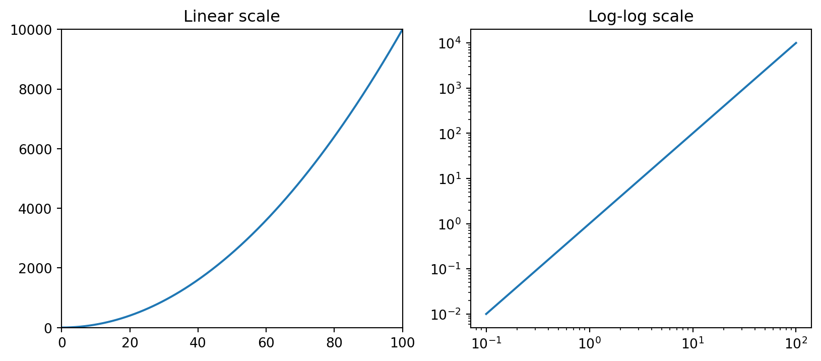
ax.set_xlim(0, 100) # set x rangeax.set_ylim(-1, 1) # set y rangeax.set_xlim(left=0) # set only one end, leave the other automaticax.set_xscale("log") # log scale on xax.set_yscale("log") # log scale on yax.set_yscale("symlog") # log-like scale that handles zero/negative values
5.2.1 ggplot2 mapping
ggplot2
matplotlib
+ xlim(0, 100)
ax.set_xlim(0, 100)
+ scale_y_log10()
ax.set_yscale("log")
+ coord_cartesian(...)
ax.set_xlim() / ax.set_ylim() without dropping data
Subtle gotcha: set_xlim() and set_ylim() do not filter data. They change only the visible window. The data remain present in the plot object. This is closer to ggplot2’s coord_cartesian() than to data filtering.
5.3 3. Ticks: the fiddly part
Ticks are where matplotlib customization often becomes verbose.
The basic split:
┌─────────────────────────────────────────────────────────┐
│ Tick locations → where the ticks appear                │
│ Tick labels    → what text shows at each tick           │
│ Tick style     → font, rotation, size, color            │
└─────────────────────────────────────────────────────────┘
5.3.1 Setting tick positions and labels
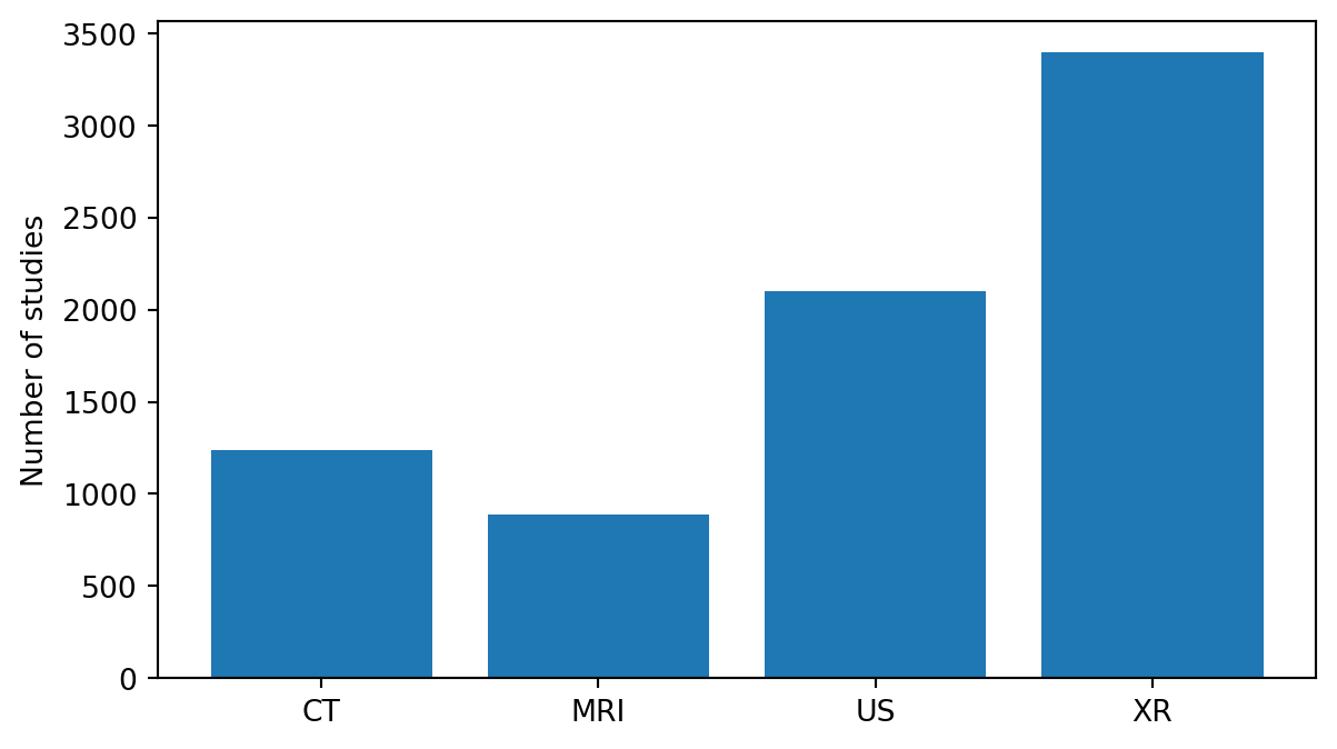
For categorical plots, it is common to set numeric positions first, then map those positions to labels.
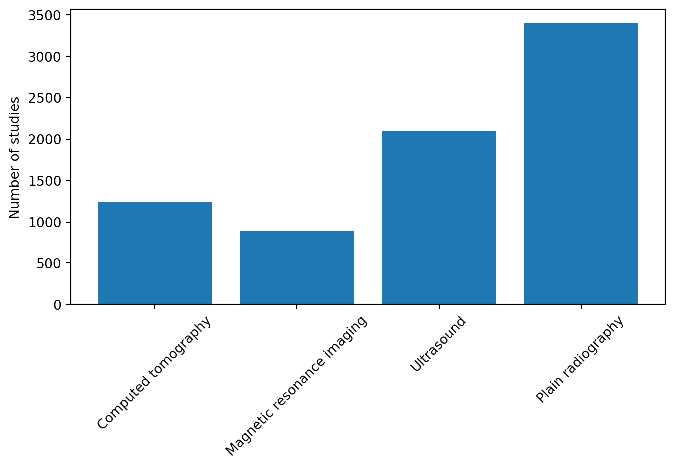
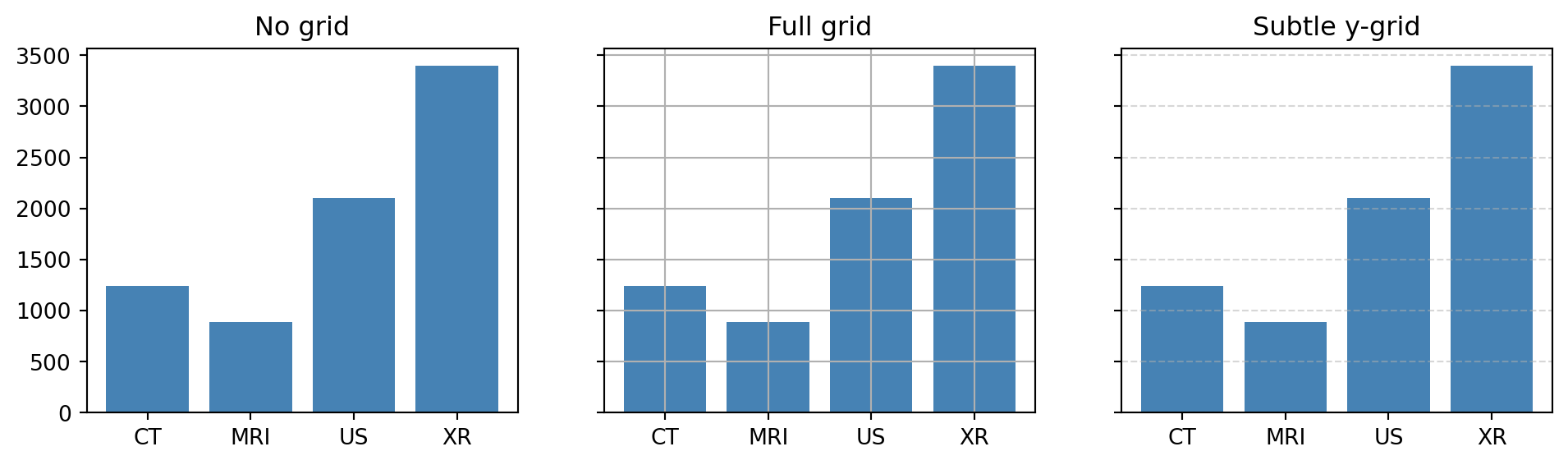
modalities = ["CT", "MRI", "US", "XR"]counts = [1240, 890, 2100, 3400]fig, ax = plt.subplots(figsize=(7, 4))ax.bar(range(len(modalities)), counts)ax.set_xticks(range(len(modalities))) # tick positions: [0, 1, 2, 3]ax.set_xticklabels(modalities) # labels at those positionsax.set_ylabel("Number of studies")plt.show()
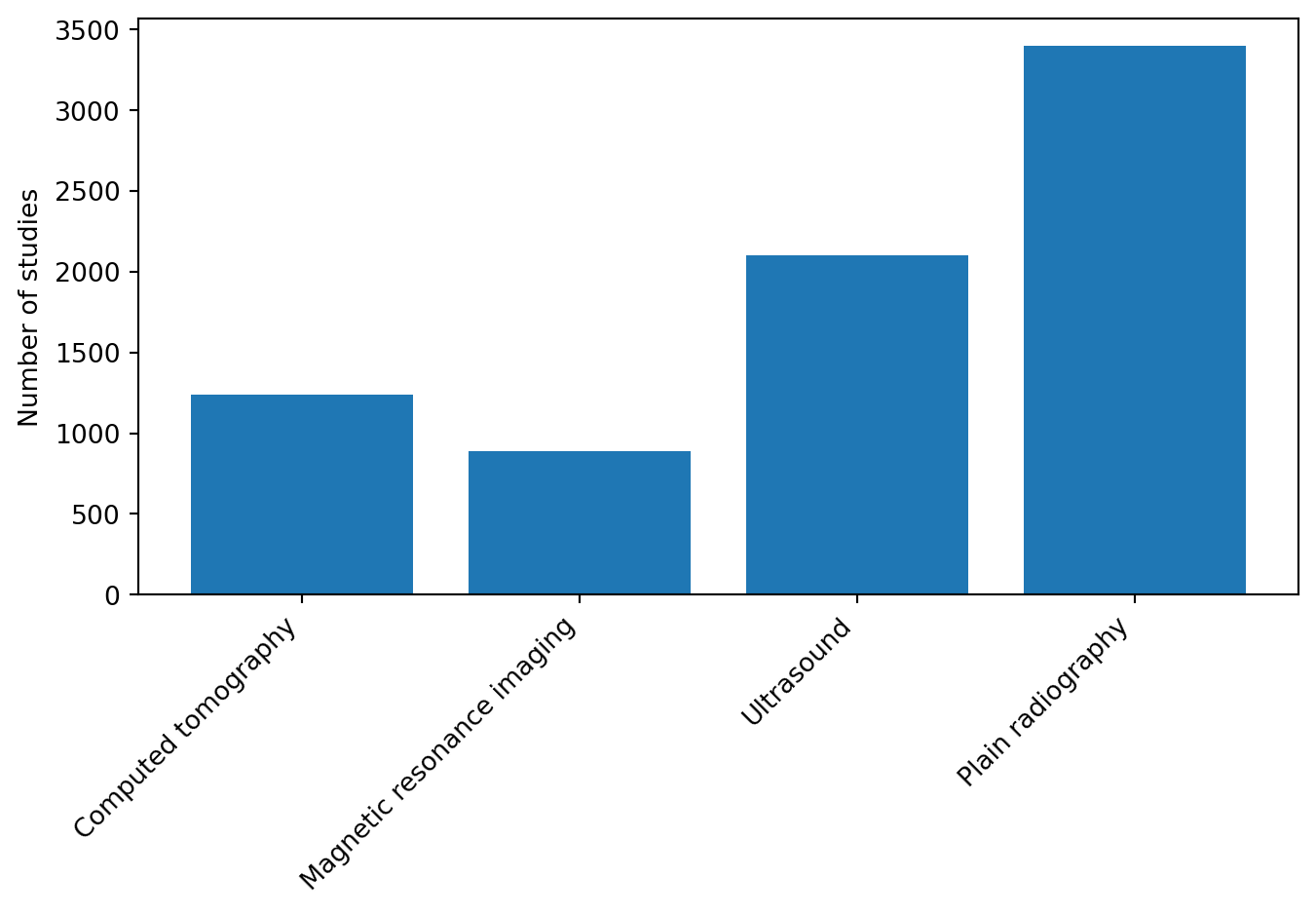
Modern matplotlib (≥3.5) can set positions and labels in one call:
fig, ax = plt.subplots(figsize=(7, 4))ax.bar(range(len(modalities)), counts)ax.set_xticks(range(len(modalities)), labels=modalities)ax.set_ylabel("Number of studies")plt.show()
5.3.2 Rotating tick labels
Rotating tick labels is very common when category names are long and overlap.
The ha="right" argument sets horizontal alignment. It makes rotated labels align cleanly with their tick marks instead of floating awkwardly.
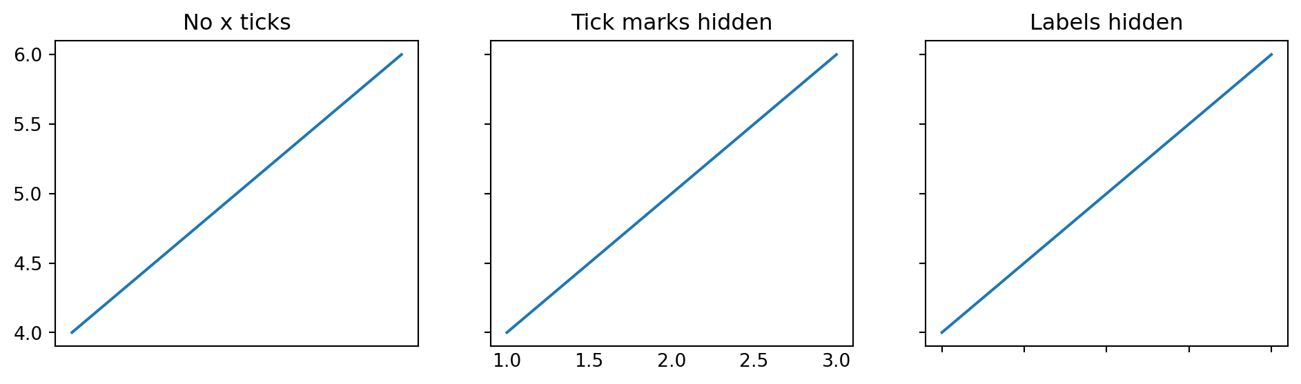
5.3.3 Removing or hiding ticks
Sometimes ticks or labels add clutter. Common patterns:
fig, axes = plt.subplots(1, 3, figsize=(12, 3), sharey=True)for ax in axes: ax.plot([1, 2, 3], [4, 5, 6])axes[0].set_title("No x ticks")axes[0].set_xticks([])axes[1].set_title("Tick marks hidden")axes[1].tick_params(axis="x", which="both", length=0)axes[2].set_title("Labels hidden")axes[2].tick_params(labelbottom=False)plt.show()
Equivalent snippets:
ax.set_xticks([]) # no ticks at allax.tick_params(axis="x", which="both", length=0) # tick marks invisible but labels stayax.tick_params(labelbottom=False) # hide x tick labels
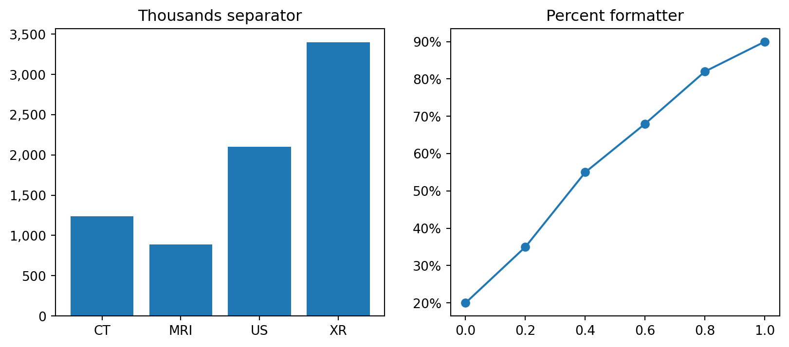
5.3.4 Formatting numeric ticks
For thousands separators, percentages, and scientific notation, use formatters from matplotlib.ticker.
from matplotlib.ticker import FuncFormatter, PercentFormatterax.yaxis.set_major_formatter(FuncFormatter(lambda x, _: f"{x:,.0f}"))ax.yaxis.set_major_formatter(PercentFormatter(xmax=1.0))
This is not something to memorize immediately. It is enough to remember that tick formatters exist, because confusing numeric tick labels are a frequent source of frustration.
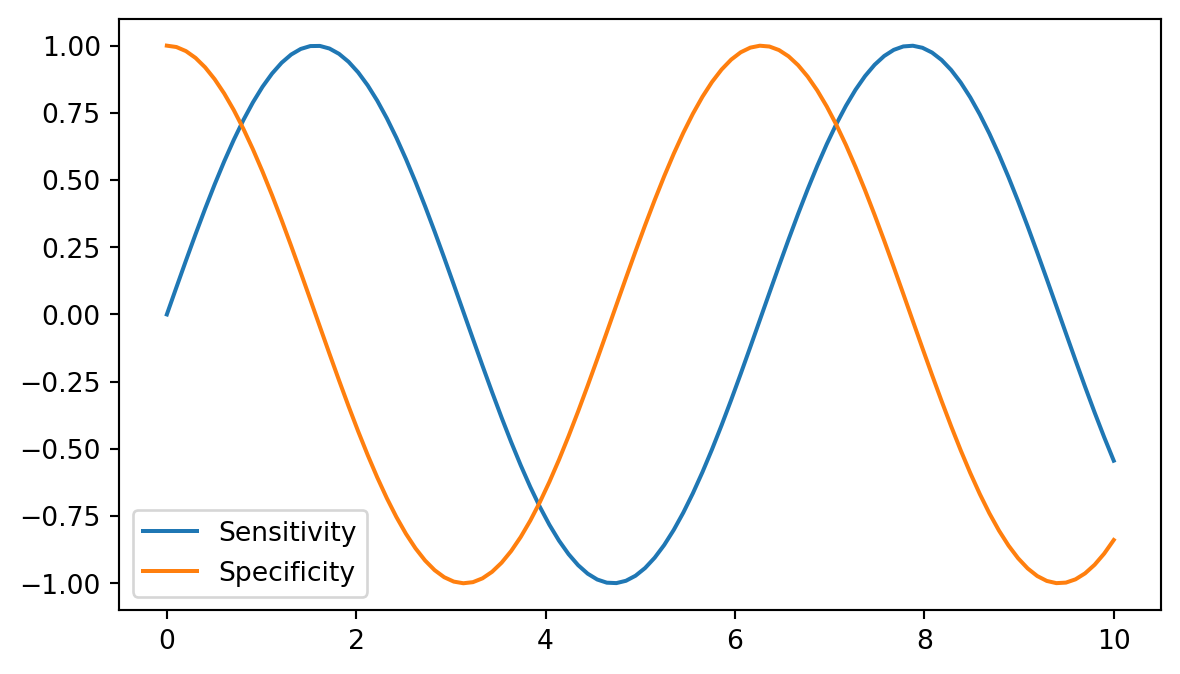
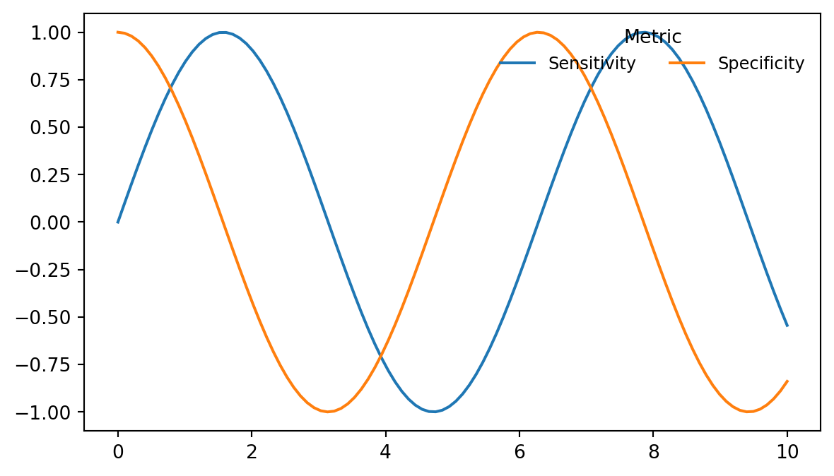
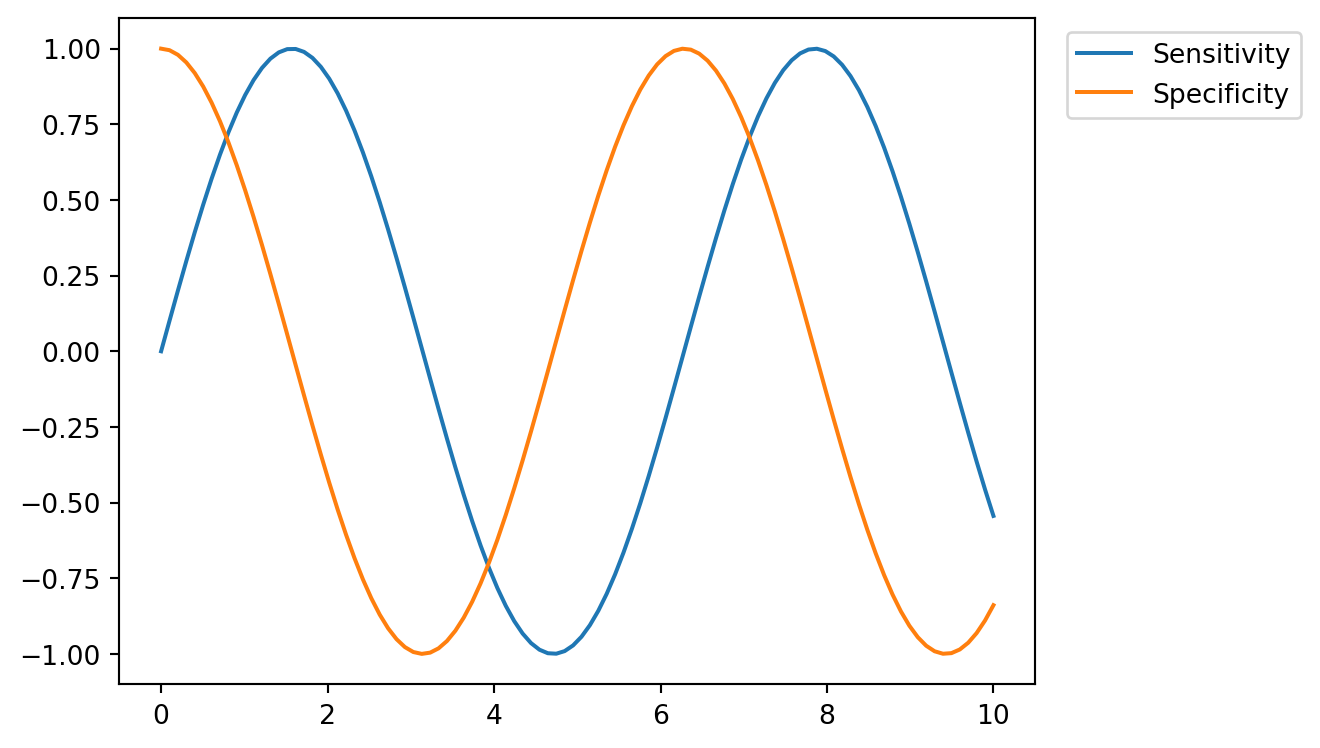
5.4 4. Legends
Legends are created from label= values in drawing calls. Calling ax.legend() then renders the legend.
 upper left        upper center        upper right
 ┌──────────────────────────────────────────────┐
 │                                              │
 │                                              │
center left          center           center right
 │                                              │
 │                                              │
 └──────────────────────────────────────────────┘
 lower left        lower center        lower right
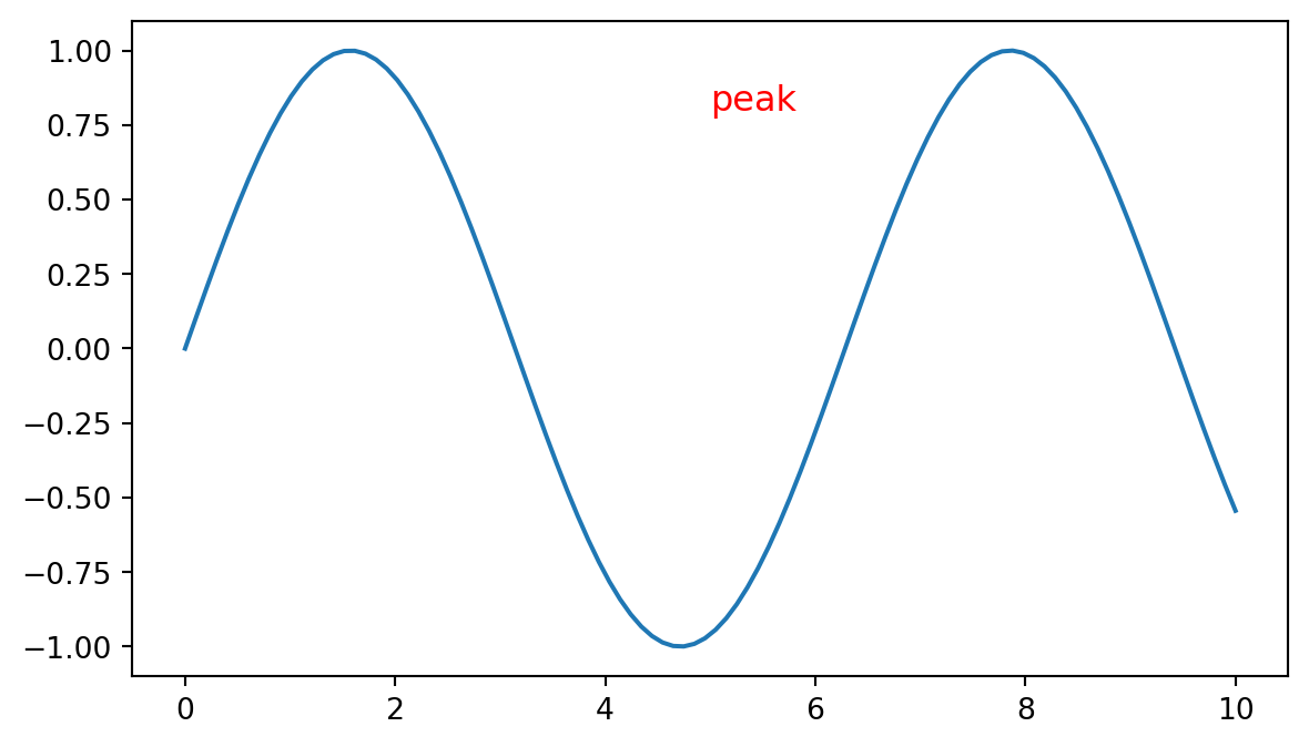
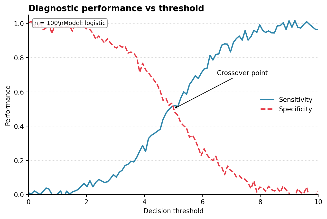
5.5 5. Annotations: text and arrows
The two main annotation tools are ax.text() and ax.annotate().
5.5.1ax.text(x, y, "..."): plain text at a coordinate
Data coords (default): same units as your data
  (5, 0.8) = x=5, y=0.8

Axes coords (transform=ax.transAxes):
  (0, 0)     = bottom-left of plot
  (1, 1)     = top-right of plot
  (0.5, 0.5) = center of plot
5.5.2ax.annotate(): text plus arrow
ax.annotate() is the classic tool for labeling a point.
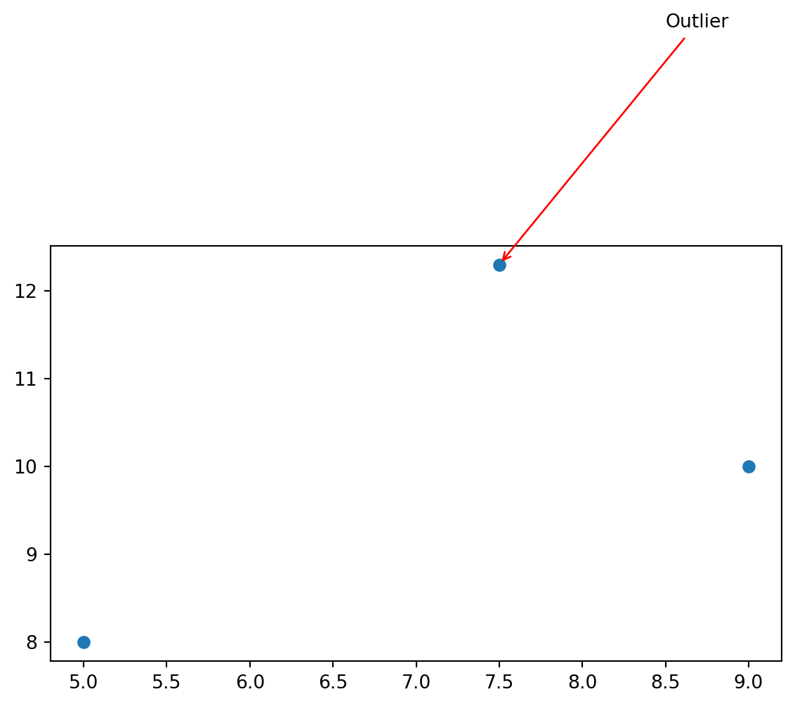
fig, ax = plt.subplots(figsize=(7, 4))ax.scatter([5, 7.5, 9], [8, 12.3, 10])ax.annotate("Outlier", xy=(7.5, 12.3), # point being annotated xytext=(8.5, 15), # text position arrowprops=dict(arrowstyle="->", color="red"), fontsize=10,)plt.show()
xy is the point being annotated. xytext is where the text label sits. The arrow is drawn between them.
The pattern: ggplot2 bundles related styling under theme(). Matplotlib spreads it across ax.set_*, ax.tick_params(), ax.spines, and ax.grid(). Once those entry points are familiar, most customization becomes searchable and predictable.
format y-axis ticks with thousands separators, such as 1,240
place a text label on top of each bar showing its count
Hint:
for i, count inenumerate(counts): ax.text(i, count +50, f"{count:,}", ha="center")
5.10.3 Exercise 3
Make a scatter plot of 50 random (x, y) points where y = x + noise. Annotate the single highest-y point with an arrow saying "max", and add a stats box in the upper-left corner of the axes using transform=ax.transAxes. The stats box should show the mean and standard deviation of y.
5.10.4 Exercise 4
Reproduce the polished example above with these changes:
log-scale the x-axis
change the colors to a colorblind-safe pair, such as "#0072B2" and "#D55E00"
move the legend outside the plot area on the right