Color in matplotlib is split into two topics that look similar but work very differently:
┌─────────────────────────────────────────────────────────┐
│ DISCRETE COLORS                                        │
│ "What color is this line / this bar / this group?"     │
│ → named colors, hex codes, color cycles                 │
├─────────────────────────────────────────────────────────┤
│ COLORMAPS                                              │
│ "How do I map a continuous variable to color?"         │
│ → cmap, vmin/vmax, norm, colorbar                       │
└─────────────────────────────────────────────────────────┘
For radiology work, the second half matters enormously. Every imshow() of a CT slice involves colormap and windowing decisions. The aim is for medical images to look correct, not like generic dashboard output.
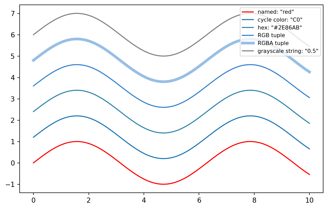
6.1 1. Specifying a single color
Matplotlib accepts colors in many formats.
import matplotlib.pyplot as pltimport numpy as npx = np.linspace(0, 10, 100)y = np.sin(x)fig, ax = plt.subplots(figsize=(8, 5))ax.plot(x, y +0.0, color="red", label='named: "red"')ax.plot(x, y +1.2, color="C0", label='cycle color: "C0"')ax.plot(x, y +2.4, color="#2E86AB", label='hex: "#2E86AB"')ax.plot(x, y +3.6, color=(0.2, 0.5, 0.8), label="RGB tuple")ax.plot(x, y +4.8, color=(0.2, 0.5, 0.8, 0.5), linewidth=4, label="RGBA tuple")ax.plot(x, y +6.0, color="0.5", label='grayscale string: "0.5"')ax.legend(loc="upper right", fontsize=8)plt.show()
Common forms:
ax.plot(x, y, color="red") # named colorax.plot(x, y, color="C0") # nth color from the cycleax.plot(x, y, color="#2E86AB") # hexax.plot(x, y, color=(0.2, 0.5, 0.8)) # RGB tuple, values 0–1ax.plot(x, y, color=(0.2, 0.5, 0.8, 0.5)) # RGBA, alpha as fourth valueax.plot(x, y, color="0.5") # grayscale string, 0=black, 1=white
Named colors include the basics, such as "red" and "steelblue", plus the xkcd survey colors via names like "xkcd:burnt orange".
Color specification — pick one and be consistent
──────────────────────────────────────────────────
Quick exploration:   "red", "steelblue", "C0"
Publication figures: hex codes, e.g. "#2E86AB"
Scientific accuracy: named scheme such as Okabe-Ito
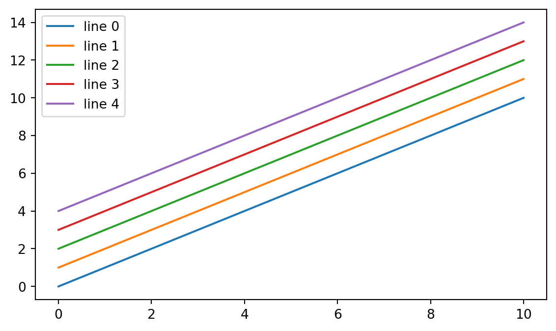
6.2 2. The default color cycle
When multiple lines are drawn without explicit colors, matplotlib cycles through a default palette.
fig, ax = plt.subplots(figsize=(7, 4))for i inrange(5): ax.plot(x, x + i, label=f"line {i}")ax.legend()plt.show()
The default cycle is based on tab10: ten distinguishable colors. You can reference them as "C0" through "C9":
This is matplotlib’s equivalent of ggplot2’s default discrete color scale.
The tab10 default cycle: C0–C9
──────────────────────────────────────────────
C0 blue      C5 brown
C1 orange    C6 pink
C2 green     C7 gray
C3 red       C8 olive
C4 purple    C9 cyan
6.3 3. Changing the color cycle
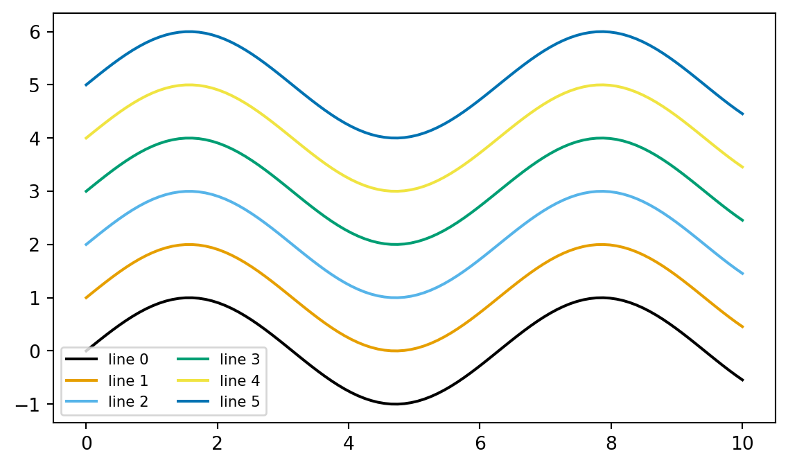
The default palette can be changed globally through rcParams. This is useful when a project should consistently use a specific palette, such as a colorblind-safe one.
import matplotlib as mplfrom cycler import cyclerokabe_ito = ["#000000", "#E69F00", "#56B4E9", "#009E73","#F0E442", "#0072B2", "#D55E00", "#CC79A7",]# Use a context so the global setting does not leak into the rest of the notebook.with mpl.rc_context({"axes.prop_cycle": cycler(color=okabe_ito)}): fig, ax = plt.subplots(figsize=(7, 4))for i inrange(6): ax.plot(x, np.sin(x) + i, label=f"line {i}") ax.legend(ncol=2, fontsize=8) plt.show()
This is roughly equivalent to setting a global ggplot2 theme. Module 7 will cover rcParams more systematically.
Useful palettes for grouped or discrete data:
Palette
Use case
Colorblind-safe?
tab10
General use, ≤10 categories
Mostly
Set1, Set2, Set3
Categorical, light/saturated
Mostly
Okabe-Ito
Scientific publications
Yes
viridis
Sequential data, not categories
Yes
6.4 4. Colormaps
A colormap maps numbers to colors. When imshow() displays a 2D array, matplotlib:
normalizes the data into [0, 1] based on vmin, vmax, or norm
looks up each normalized value in the colormap
paints each pixel with the resulting color
Your data       Normalize to [0,1]      Colormap lookup       Pixels
────────        ────────────────        ───────────────       ──────
[-200, 50, 800] → [0.0, 0.25, 1.0]  →   bone(0.0)=black      ▓▓
                                           bone(0.25)=gray    ▒▒
                                           bone(1.0)=white    ░░
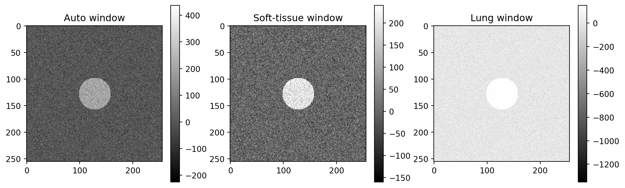
This means vmin and vmax are not cosmetic. They determine which numbers map to which colors. For radiology, this is windowing.
6.4.1 Three families of colormaps
┌──────────────────────────────────────────────────────────┐
│ SEQUENTIAL — data goes from low to high                  │
│ Examples: "viridis", "magma", "Blues", "gray", "bone" │
│ Use for: density, intensity, dose, signal, count          │
│ low ░░░▒▒▒▓▓▓ high                                      │
├──────────────────────────────────────────────────────────┤
│ DIVERGING — data centered on a meaningful midpoint        │
│ Examples: "RdBu", "coolwarm", "seismic", "PiYG"        │
│ Use for: differences, deviations, correlations            │
│ negative ▓▓▓▒▒▒░░░▒▒▒▓▓▓ positive                        │
│                    ↑                                     │
│              zero or neutral midpoint                     │
├──────────────────────────────────────────────────────────┤
│ QUALITATIVE — unordered categories                        │
│ Examples: "tab10", "Set1", "Pastel1"                   │
│ Use for: discrete groups                                  │
│ cat A ▓  cat B ▒  cat C ░                                │
└──────────────────────────────────────────────────────────┘
The key rule: match the colormap family to the data structure.
Sequential maps are for “more is more” data, such as HU values, dose, signal intensity, or counts.
Diverging maps are for values centered on a meaningful midpoint, such as a residual map or pre/post difference image.
Qualitative maps are for categories, not continuous measurements.
6.4.2 Specific colormap recommendations
Data type
Recommended colormap
CT/MRI grayscale display
"gray" or "bone"
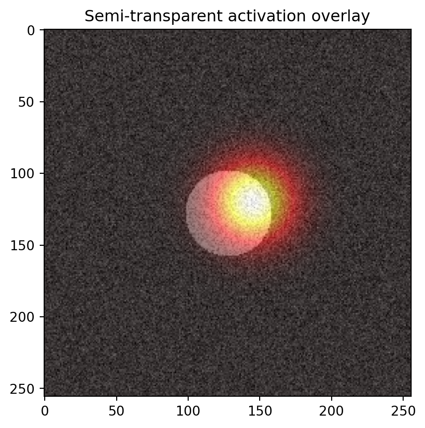
PET / fMRI activation overlay
"hot" or "magma"
Probability map from 0 to 1
"viridis"
Difference image centered on 0
"RdBu_r" or "seismic"
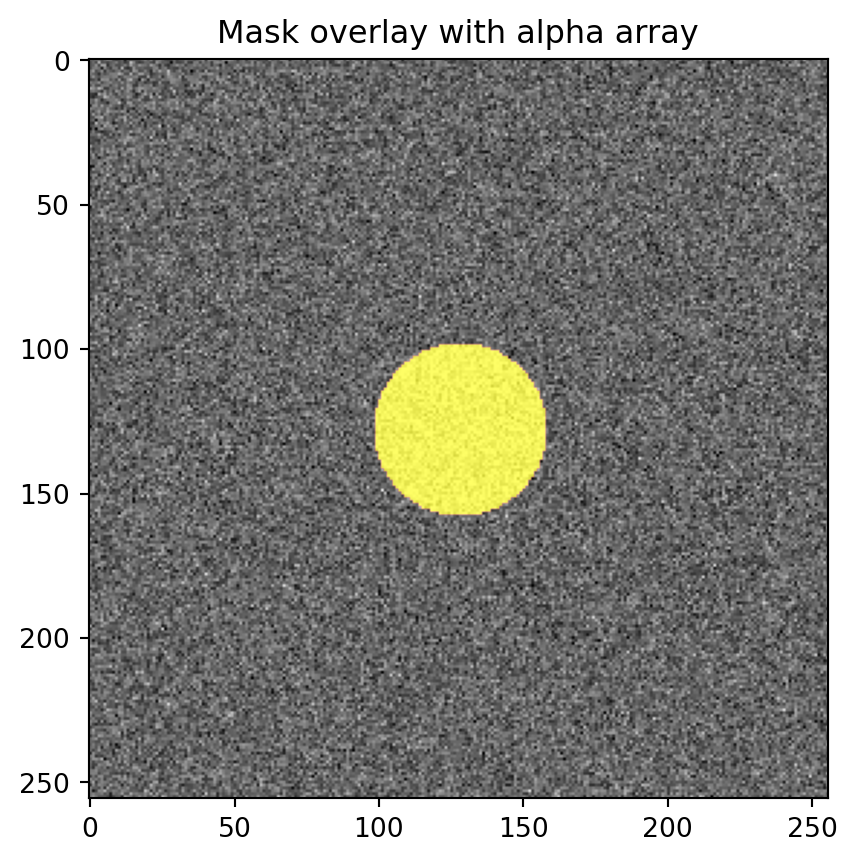
Segmentation mask overlay
custom colors + alpha
General heatmap of a 2D quantity
"viridis"
The _r suffix means reversed. For example, "RdBu_r" makes red positive and blue negative, which many readers interpret naturally as hot/cold.
6.5 5. vmin, vmax, and norm
These are the windowing controls. By default, imshow() uses vmin=data.min() and vmax=data.max(), which is rarely ideal for medical imaging.
This formula is genuinely useful for radiology plotting.
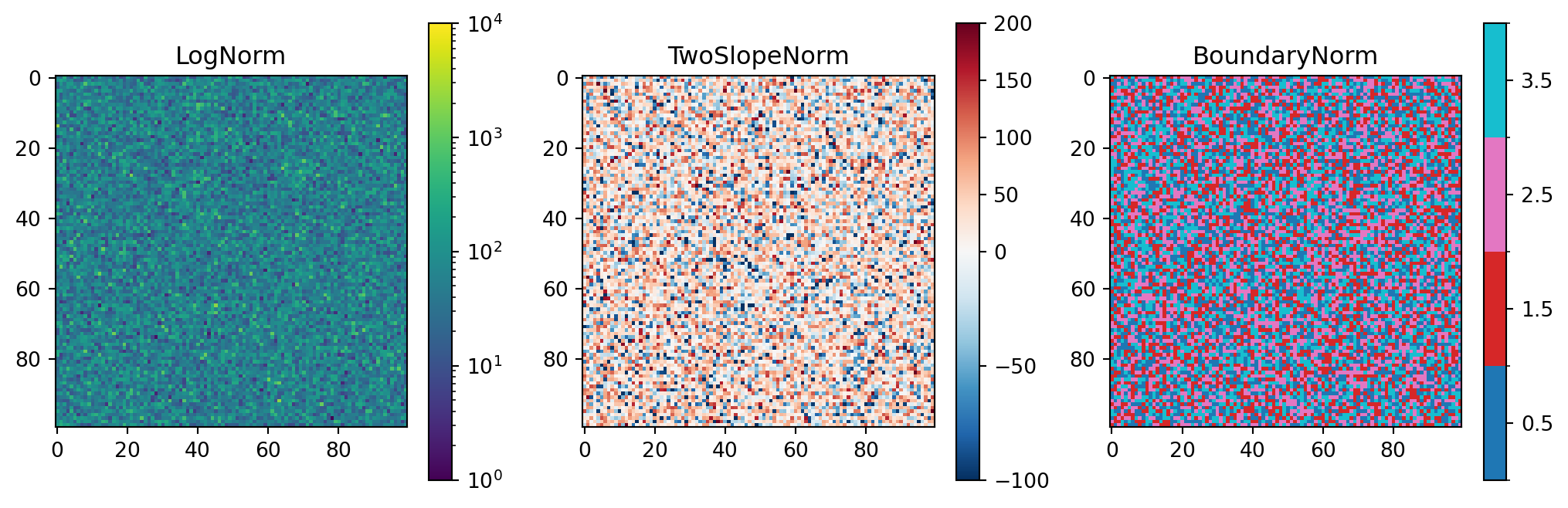
6.5.1 Beyond vmin and vmax: norm
For nonlinear color mapping, use norm=.
from matplotlib.colors import LogNorm, TwoSlopeNorm, BoundaryNormfig, axes = plt.subplots(1, 3, figsize=(13, 4))# Logarithmic normalization for data spanning orders of magnitudedata_log = np.exp(rng.normal(4, 1.0, size=(100, 100)))im0 = axes[0].imshow(data_log, cmap="viridis", norm=LogNorm(vmin=1, vmax=1e4))axes[0].set_title("LogNorm")fig.colorbar(im0, ax=axes[0])# Diverging normalization with zero forced to the centerdiff = rng.normal(20, 60, size=(100, 100))im1 = axes[1].imshow(diff, cmap="RdBu_r", norm=TwoSlopeNorm(vcenter=0, vmin=-100, vmax=200))axes[1].set_title("TwoSlopeNorm")fig.colorbar(im1, ax=axes[1])# Boundary normalization for discrete labels/classesseg = rng.integers(0, 4, size=(100, 100))im2 = axes[2].imshow(seg, cmap="tab10", norm=BoundaryNorm([0, 1, 2, 3, 4], ncolors=10))axes[2].set_title("BoundaryNorm")fig.colorbar(im2, ax=axes[2], ticks=[0.5, 1.5, 2.5, 3.5])plt.show()
TwoSlopeNorm(vcenter=0, ...) is especially useful. It ensures that zero is exactly at the neutral midpoint of a diverging colormap, even when the positive and negative ranges are not symmetric. Without it, zero can shift off-center and the image can mislead the eye.
6.6 6. Colorbars
The colorbar is the legend for a colormap. The standard pattern is to capture the returned mappable object, then pass it to fig.colorbar().
Make a line plot with five lines y = x + i for i in range(5), but color them using the Okabe-Ito palette from section 3. Use a different color for each line, picked manually.
6.10.2 Exercise 2
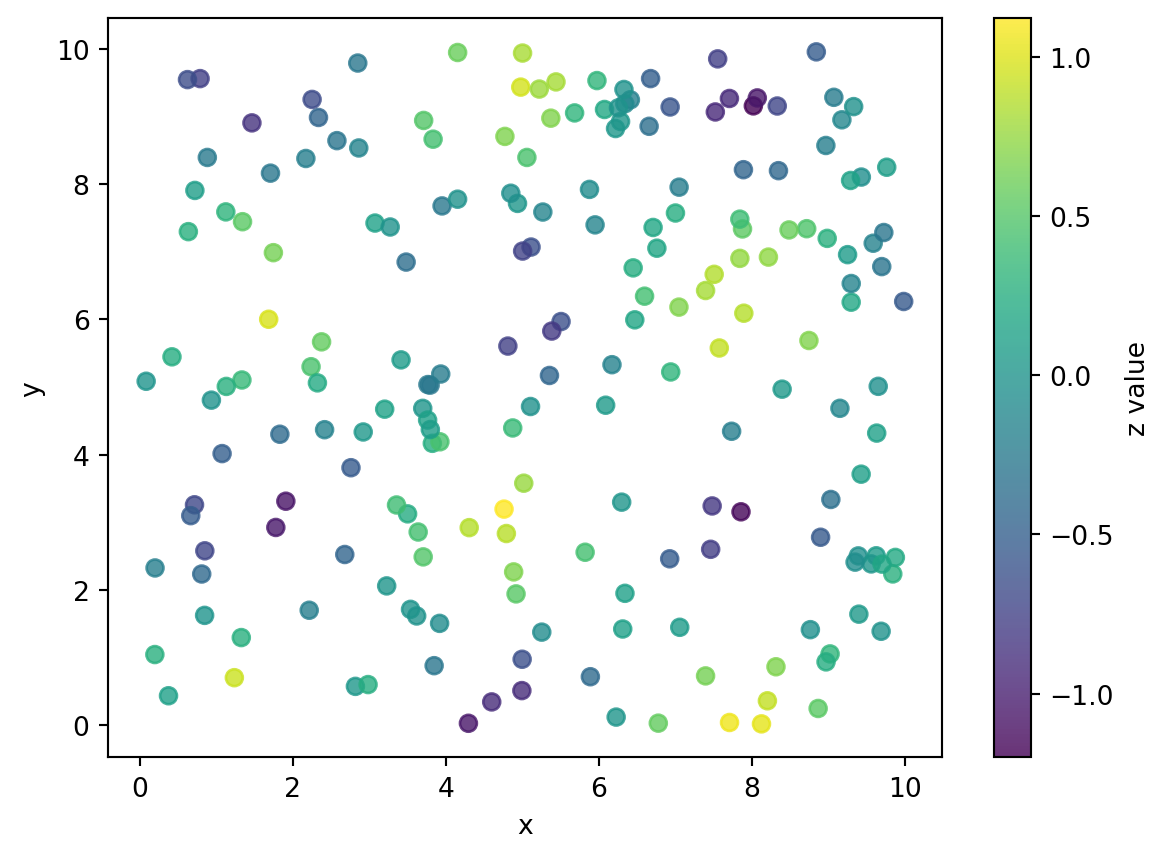
Generate 200 points where x ~ Uniform(0, 10), y ~ Uniform(0, 10), and z = sin(x) * cos(y) + Normal(0, 0.1). Make a scatter plot with c=z and a sequential colormap of your choice. Add a colorbar labeled "z value".
6.10.3 Exercise 3
Build the three-panel windowing example in section 5, but with this twist: instead of three different windows on one slice, simulate a difference image by subtracting two slices. Display it in one panel using cmap="RdBu_r" and TwoSlopeNorm(vcenter=0). Make sure zero appears as white or neutral. Add a colorbar.
6.10.4 Exercise 4
Simulate a 256×256 grayscale slice and a binary mask, such as a circle. Display the slice in "gray" with the mask shown as a colored, semi-transparent overlay on top, but only where the mask is 1. Use the alpha-array trick from section 7.
6.10.5 Exercise 5: conceptual
For each data type, decide which colormap family is appropriate and pick a specific colormap:
A heatmap of pixel-wise mean absolute error between two AI segmentation models.
A map of SUV on a PET image.
A confusion matrix where each cell is the count of cases.
A pixel-wise change in HU between pre- and post-contrast CT.
A label map where each integer represents a different organ.
This exercise is where the conceptual distinction between sequential, diverging, and qualitative colormaps matters most.