import matplotlib.pyplot as plt
import numpy as np
fig, axes = plt.subplots(nrows=2, ncols=3, figsize=(12, 6))
print(axes.shape)
plt.show()(2, 3)
This module is the matplotlib equivalent of facet_wrap() and facet_grid() in ggplot2, except matplotlib does not auto-facet. You decide the grid, then populate each cell.
More work, more control.
The mental model:
┌──────────────────────────────────────────────────────────┐
│ A Figure can hold many Axes objects in a layout.         │
│ You choose the layout, then draw on each Axes one at     │
│ a time. Each Axes is independent: its own data, title,   │
│ ticks, colors, and annotations.                          │
└──────────────────────────────────────────────────────────┘
Matplotlib gives several ways to lay out multiple panels, in increasing order of flexibility:
plt.subplots(nrows, ncols) — regular grid; useful for most casessubplot_mosaic("AB;CC") — named, irregular grid; modern favoriteGridSpec — full control over rows, columns, and spansfig.add_axes([x, y, w, h]) — place an Axes at exact coordinatesStart with plt.subplots(). Use subplot_mosaic() when the layout becomes irregular. Learn GridSpec when subplot_mosaic() is not enough. Use fig.add_axes() mostly for inset plots.
plt.subplots() for regular gridsThe common pattern is to create a Figure plus an array of Axes objects.
import matplotlib.pyplot as plt
import numpy as np

fig, axes = plt.subplots(nrows=2, ncols=3, figsize=(12, 6))
print(axes.shape)
plt.show()
(2, 3)
For plt.subplots(2, 3), axes is a 2D NumPy array of Axes objects with shape (2, 3). Individual panels are accessed by indexing.
x = np.linspace(0, 10, 100)
rng = np.random.default_rng(0)

fig, axes = plt.subplots(nrows=2, ncols=3, figsize=(12, 6))

axes[0, 0].plot(x, np.sin(x))
axes[0, 0].set_title("sin(x)")

axes[0, 1].plot(x, np.cos(x))
axes[0, 1].set_title("cos(x)")

axes[1, 2].hist(rng.normal(size=200), bins=20)
axes[1, 2].set_title("histogram")

plt.show()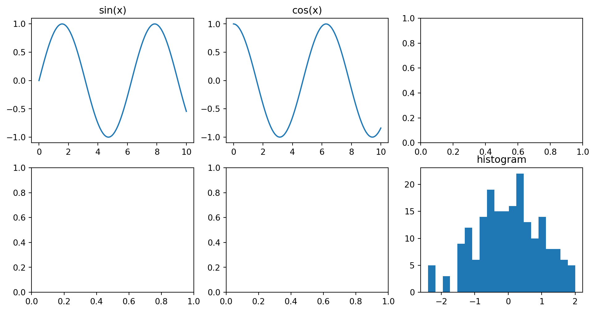
The shape of axes for plt.subplots(2, 3):
                  col 0        col 1        col 2
              ┌─────────┐  ┌─────────┐  ┌─────────┐
row 0         │axes[0,0]│  │axes[0,1]│  │axes[0,2]│
              └─────────┘  └─────────┘  └─────────┘
              ┌─────────┐  ┌─────────┐  ┌─────────┐
row 1         │axes[1,0]│  │axes[1,1]│  │axes[1,2]│
└─────────┘ └─────────┘ └─────────┘When nrows=1 or ncols=1, the returned axes object may not be 2D.
fig, axes = plt.subplots(1, 3)  # shape (3,), a 1D array
axes[0].plot(...)              # works
axes[0, 0].plot(...)           # IndexError

fig, axes = plt.subplots(1, 1)  # a single Axes, not an array
axes.plot(...)                  # works
axes[0].plot(...)               # TypeError
Two ways to avoid thinking about this too much:
# Option A: always return a 2D array
fig, axes = plt.subplots(1, 3, squeeze=False)  # shape (1, 3)

# Option B: flatten and iterate
fig, axes = plt.subplots(2, 3)
for ax in axes.flat:
    ax.set_xlabel("x")
axes.flat gives a 1D iterator over all panels, regardless of grid shape. It is very useful for loop-driven plotting.
fig, axes = plt.subplots(2, 3, figsize=(10, 5))

for i, ax in enumerate(axes.flat):
    ax.plot(x, np.sin(x + i))
    ax.set_title(f"Panel {i + 1}")
    ax.set_xlabel("x")

fig.tight_layout()
plt.show()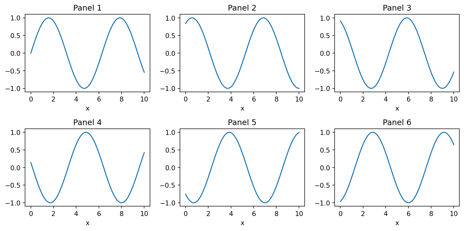
Faceted plotting in matplotlib is usually a for loop.
def simulate_dose_data(modality, n=200, seed=0):
    rng = np.random.default_rng(seed + hash(modality) % 1000)
    params = {
        "CT": (8.0, 1.5),
        "MRI": (0.0, 0.02),
        "US": (0.0, 0.01),
        "XR": (0.10, 0.04),
    }
    mean, sd = params[modality]
    return np.clip(rng.normal(mean, sd, n), 0, None)

modalities = ["CT", "MRI", "US", "XR"]
fig, axes = plt.subplots(2, 2, figsize=(10, 7))

for ax, modality in zip(axes.flat, modalities):
    data = simulate_dose_data(modality)
    ax.hist(data, bins=20, color="steelblue", edgecolor="white")
    ax.set_title(modality)
    ax.set_xlabel("Dose (mSv)")

fig.tight_layout()
plt.show()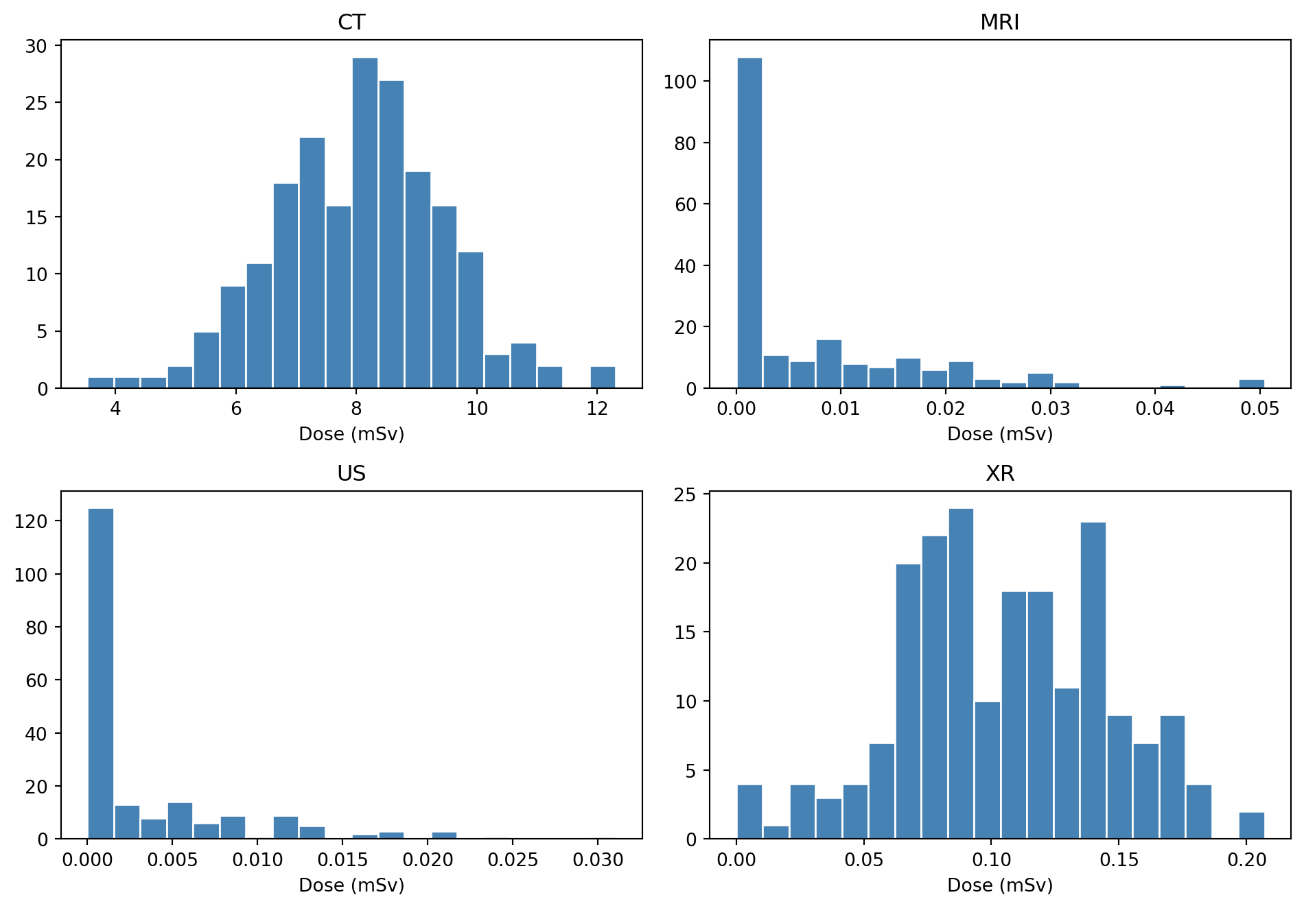
This is the matplotlib equivalent of facet_wrap(~ modality). It is verbose, but it gives full control over each panel. If one modality needs a different x-range or annotation, use a normal if block inside the loop.
sharex and shareyWhen panels show the same kind of data, shared scales make comparison easier.
fig, axes = plt.subplots(
    2,
    2,
    figsize=(8, 6),
    sharex=True,
    sharey=True,
)

for ax, modality in zip(axes.flat, modalities):
    data = simulate_dose_data(modality)
    ax.hist(data, bins=20, color="steelblue", edgecolor="white")
    ax.set_title(modality)

fig.supxlabel("Dose (mSv)")
fig.supylabel("Count")
fig.tight_layout()
plt.show()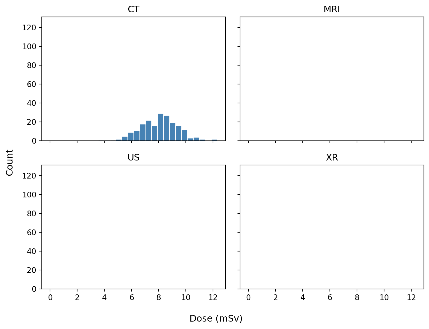
With sharex=True, all panels use the same x-range, and matplotlib automatically hides repeated x tick labels except on the bottom row. sharey=True does the same for the y-axis.
Shared axes are useful when the reader should compare panels directly. Avoid sharing axes when panels genuinely need different scales to reveal different structures.
Shared versus independent y-axes:
sharey=True                         sharey=False (default)
─────────────────                   ─────────────────
20│ ┌──────┐ ┌──────┐              20│ ┌──────┐   5│ ┌──────┐
10│ │  ╱   │ │  ╱╲  │              10│ │  ╱   │   3│ │  ╱╲  │
 0└─┴──────┘ └──────┘               0└─┴──────┘   0└─┴──────┘
   panels comparable                    panels independent
For more control, specific axes can be shared after creation:
fig, axes = plt.subplots(1, 3)
axes[1].sharey(axes[0])
axes[2].sharey(axes[0])
After sharing, zooming or changing limits on one shared axis affects the others.
subplot_mosaic: the modern favoriteFor irregular layouts, subplot_mosaic() is often more readable than GridSpec. You describe the layout as a string or list, and panels are returned as a dictionary keyed by name.
image_data = rng.normal(0, 1, size=(80, 80))
values = rng.normal(size=300)

fig, axd = plt.subplot_mosaic(
    """
    AAB
    CCB
    """,
    figsize=(10, 6),
    layout="constrained",
)

axd["A"].plot(x, np.sin(x))
axd["A"].set_title("Panel A: top-left, wide")

axd["B"].imshow(image_data, cmap="gray")
axd["B"].set_title("Panel B: full right column")
axd["B"].axis("off")

axd["C"].hist(values, bins=20, color="steelblue", edgecolor="white")
axd["C"].set_title("Panel C: bottom-left, wide")

plt.show()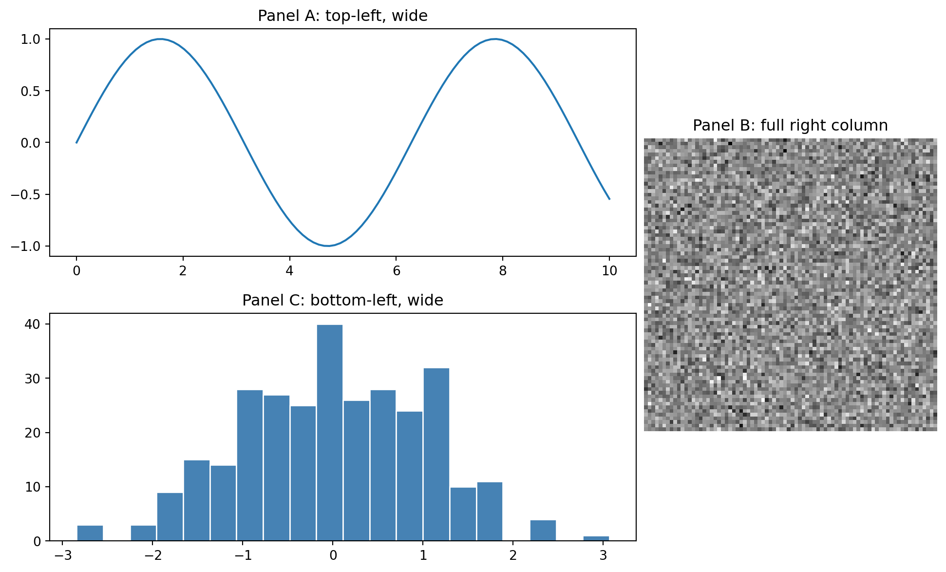
The mosaic string "AAB / CCB" produces this layout:
┌───────────────┬───────┐
│               │       │
│       A       │       │
│               │       │
├───────────────┤   B   │
│               │       │
│       C       │       │
│               │       │
└───────────────┴───────┘
Each character is one cell in a grid. Repeating a character makes that panel span cells. Use . for empty cells:
"""
AAB
.CB
"""
This makes many irregular layouts simple and readable.
A common publication layout has a large image, a dedicated colorbar slot, and a side panel for a quantitative plot.
slice_2d = rng.normal(0, 50, (256, 256))
yy, xx = np.ogrid[:256, :256]
slice_2d[(xx - 128) ** 2 + (yy - 128) ** 2 < 30 ** 2] += 200
profile_x = np.arange(slice_2d.shape[1])
profile_y = slice_2d[128, :]

fig, axd = plt.subplot_mosaic(
    """
    IIIC.PP
    IIIC.PP
    IIIC.PP
    """,
    figsize=(12, 5),
    gridspec_kw={"wspace": 0.1},
    layout="constrained",
)

im = axd["I"].imshow(slice_2d, cmap="gray", vmin=-160, vmax=240)
axd["I"].set_title("CT slice")
axd["I"].axis("off")

fig.colorbar(im, cax=axd["C"], label="HU")

axd["P"].plot(profile_x, profile_y)
axd["P"].set_title("Intensity profile")
axd["P"].set_xlabel("Position (pixels)")
axd["P"].set_ylabel("HU-like value")

plt.show()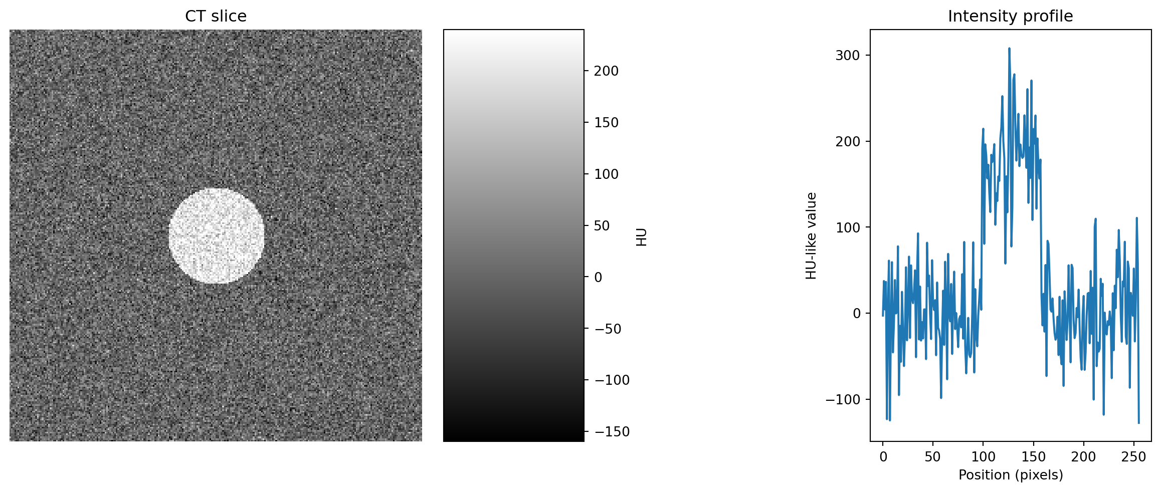
cax= tells colorbar() to draw into an existing Axes. This is different from ax=, which tells matplotlib which axes to steal space from.
That distinction is the trick for placing a colorbar exactly where it should go.
GridSpec: when mosaic is not enoughGridSpec is the lower-level layout engine behind subplots() and subplot_mosaic().
Reach for it when you need:
import matplotlib.gridspec as gridspec

fig = plt.figure(figsize=(10, 6), layout="constrained")
gs = gridspec.GridSpec(
    2,
    3,
    figure=fig,
    width_ratios=[3, 1, 1],
    height_ratios=[1, 2],
    wspace=0.3,
    hspace=0.4,
)

ax1 = fig.add_subplot(gs[0, 0])   # top-left
ax2 = fig.add_subplot(gs[1, 0])   # bottom-left
ax3 = fig.add_subplot(gs[:, 1:])  # right side, all rows

ax1.plot(x, np.sin(x))
ax1.set_title("gs[0, 0]")

ax2.plot(x, np.cos(x), color="C1")
ax2.set_title("gs[1, 0]")

ax3.imshow(slice_2d, cmap="gray", vmin=-160, vmax=240)
ax3.set_title("gs[:, 1:]")
ax3.axis("off")

plt.show()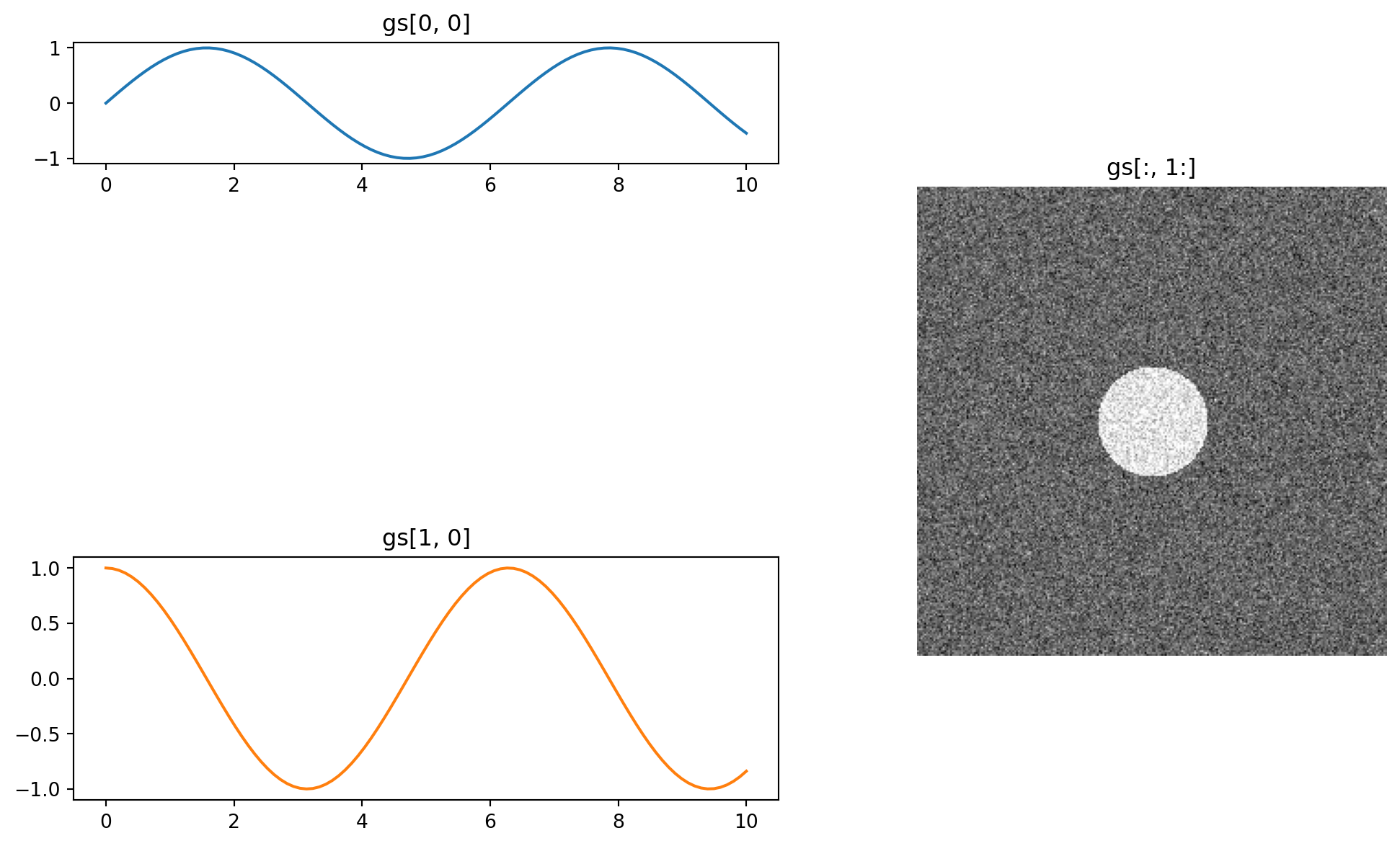
GridSpec slicing works like NumPy slicing:
gs[0, 0]     one cell, top-left
gs[0, :]     entire top row
gs[:, 0]     entire left column
gs[1:, 1:]   bottom-right block
gs[0, 1:3]   top row, columns 1 and 2
For most use cases, subplot_mosaic() covers the same ground more readably. Use GridSpec mainly when widths or heights need to be uneven or computed programmatically.
Insets are useful for zoom-in views, small legends, or local statistics.
x_scatter = rng.uniform(0, 10, 200)
y_scatter = x_scatter + rng.normal(0, 1.2, 200)

fig, ax = plt.subplots(figsize=(8, 5), layout="constrained")
ax.scatter(x_scatter, y_scatter, alpha=0.6)
ax.set_xlabel("x")
ax.set_ylabel("y")
ax.set_title("Scatter with inset zoom")

# Inset relative to the parent axes: [left, bottom, width, height]
inset = ax.inset_axes([0.58, 0.58, 0.35, 0.35])
inset.scatter(x_scatter, y_scatter, alpha=0.6, s=15)
inset.set_xlim(4, 5)
inset.set_ylim(2, 7)
inset.set_title("zoom", fontsize=9)

ax.indicate_inset_zoom(inset, edgecolor="red")
plt.show()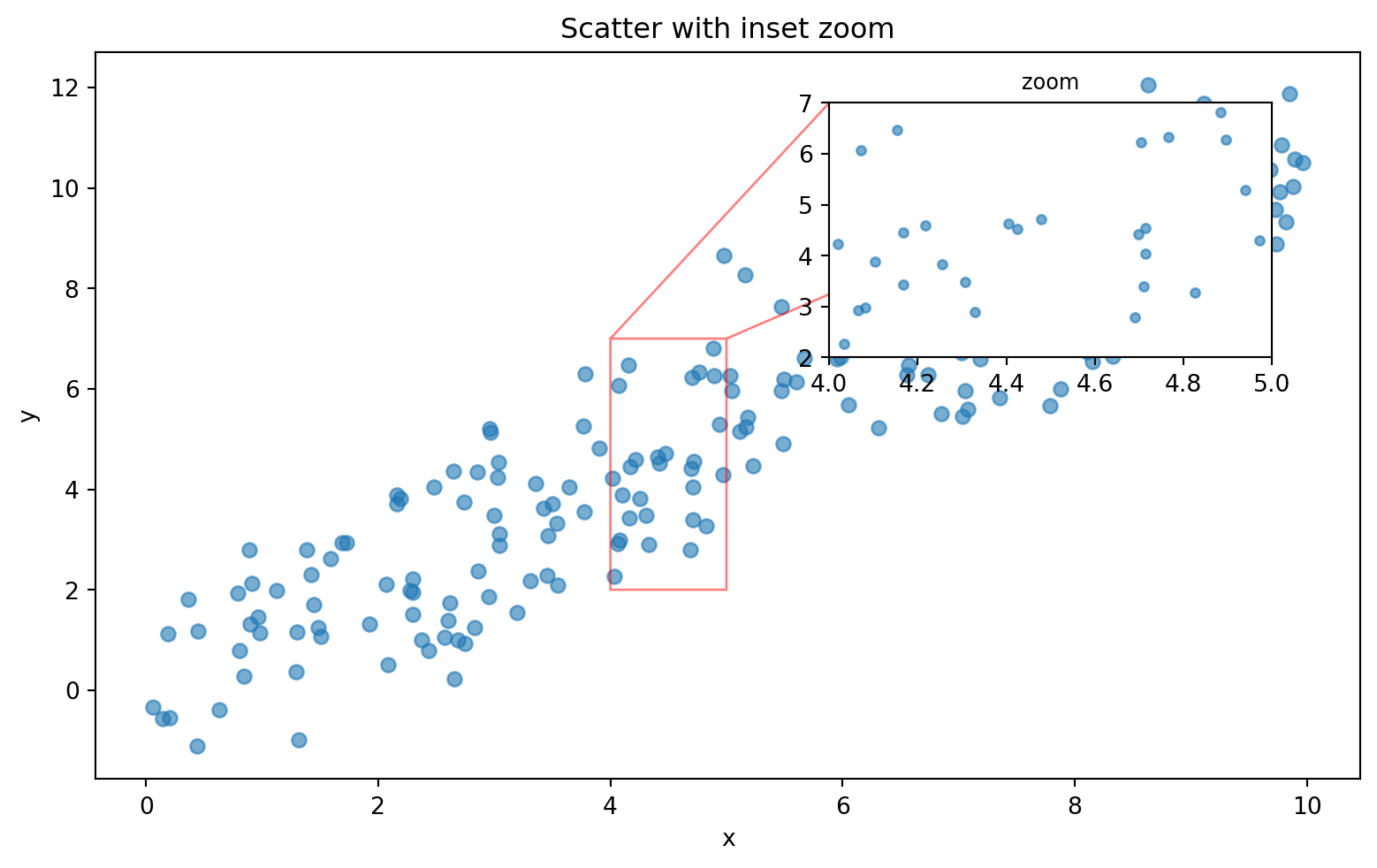
Two clean approaches:
# Way 1: absolute figure coordinates, all in 0–1 of the figure
inset = fig.add_axes([0.6, 0.6, 0.25, 0.25])

# Way 2: relative to the parent axes, often more useful
inset = ax.inset_axes([0.6, 0.6, 0.35, 0.35])
ax.indicate_inset_zoom() is especially helpful: it draws the rectangle and connecting lines automatically after the inset limits define the zoomed region.
Panel spacing is a perennial matplotlib headache. Three layout approaches matter:
fig.tight_layout()                    # classic, adjusts after the fact
fig.set_layout_engine("constrained")  # newer, smarter layout engine
plt.subplots(..., layout="constrained")
Layout managers
─────────────────────────────────────────
tight_layout Old standard. Usually fine, but can glitch with colorbars.
constrained Newer and more robust. Handles colorbars, suptitles,
and shared axes better. Usually the right choice.
manual fig.subplots_adjust(left=, right=, ...)
Use only when exact control is needed.For modern code, prefer:
fig, axes = plt.subplots(2, 2, figsize=(10, 7), layout="constrained")For fine-tuning, wspace and hspace control gaps between panels:
fig, axes = plt.subplots(2, 2, gridspec_kw={"wspace": 0.4, "hspace": 0.5})fig.suptitle() titles the whole figure. Each ax.set_title() titles one panel.
fig, axes = plt.subplots(1, 2, figsize=(9, 4), layout="constrained")
axes[0].plot(x, np.sin(x))
axes[0].set_title("Sine")
axes[1].plot(x, np.cos(x))
axes[1].set_title("Cosine")

fig.suptitle("Annual radiology metrics, 2024", fontsize=14, fontweight="bold")
plt.show()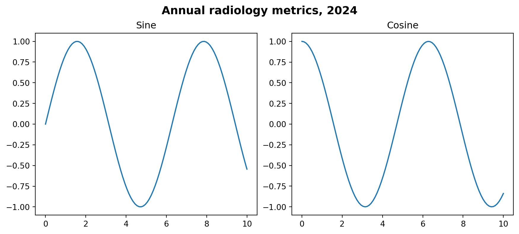
With layout="constrained", suptitles and panel titles usually coexist without overlap.
This 2×2 dashboard combines several patterns from the module.
rng = np.random.default_rng(0)

# Simulated data
modalities = ["CT", "MRI", "US", "XR"]
counts = [1240, 890, 2100, 3400]
ages = rng.normal(55, 18, 1000).clip(0, 100)
slice_2d = rng.normal(0, 50, (256, 256))
yy, xx = np.ogrid[:256, :256]
slice_2d[(xx - 128) ** 2 + (yy - 128) ** 2 < 30 ** 2] += 200
months = np.arange(1, 13)
volume = 200 + 30 * np.sin(months / 2) + rng.normal(0, 10, 12)

fig, axd = plt.subplot_mosaic(
    """
    AB
    CD
    """,
    figsize=(12, 8),
    layout="constrained",
)

# A: bar chart
axd["A"].bar(modalities, counts, color="#2E86AB")
axd["A"].set_title("Studies per modality")
axd["A"].set_ylabel("Count")
axd["A"].spines[["top", "right"]].set_visible(False)

# B: histogram
axd["B"].hist(ages, bins=30, color="#E63946", edgecolor="white")
axd["B"].set_title("Patient age distribution")
axd["B"].set_xlabel("Age (years)")
axd["B"].spines[["top", "right"]].set_visible(False)

# C: image with colorbar
im = axd["C"].imshow(slice_2d, cmap="gray", vmin=-160, vmax=240)
axd["C"].set_title("Sample CT slice")
axd["C"].axis("off")
fig.colorbar(im, ax=axd["C"], shrink=0.8, label="HU")

# D: time series
axd["D"].plot(months, volume, marker="o", color="#0072B2")
axd["D"].set_title("Monthly study volume")
axd["D"].set_xlabel("Month")
axd["D"].set_ylabel("Studies")
axd["D"].set_xticks(months)
axd["D"].spines[["top", "right"]].set_visible(False)
axd["D"].grid(True, axis="y", linestyle=":", alpha=0.5)

fig.suptitle("Radiology AI Unit — 2024 Summary", fontsize=15, fontweight="bold")
plt.show()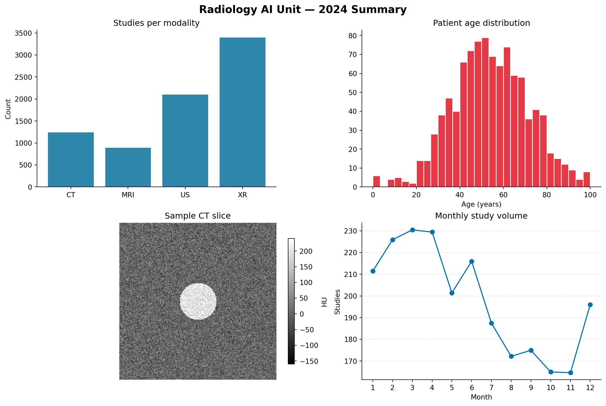
Notice the patterns:
fig.colorbar(im, ax=axd["C"])layout="constrained" keeps the figure readable without manual spacing tweaks| ggplot2 / patchwork | matplotlib |
|---|---|
facet_wrap(~ var) |
plt.subplots() + for-loop over groups |
facet_grid(row ~ col) |
plt.subplots(nrows, ncols) + manual loop over row/column/group |
patchwork: p1 + p2 / p3 |
plt.subplot_mosaic("AB;CC") |
patchwork: p1 + plot_layout(...) |
GridSpec(width_ratios=, height_ratios=) |
inset_element(p2, ...) |
ax.inset_axes(...) |
The honest difference: ggplot2 plus patchwork is usually more concise for non-trivial layouts. Matplotlib’s looser grid gives more independent control over each panel, which matters in scientific publishing.
Make a 2×2 grid of histograms, one for each distribution:
Normal(0, 1)Normal(0, 2)Uniform(-3, 3)Exponential(1) using rng.exponential(1, 200)Use sharex=True and sharey=True so the panels are directly comparable. Title each panel with the distribution name and add fig.suptitle("Distribution comparison").
Use subplot_mosaic() to create this layout, then populate each panel with a different plot:
AABB
AABB
CCDE
A and B are large top panels. C, D, and E are small bottom panels, with C wider than D and E.
Create a 1×3 figure showing the same simulated CT slice in three different windows: soft tissue, lung, and bone. Use the width/level to vmin/vmax conversions from Module 5. Use sharex and sharey to lock the panels together.
Add one shared colorbar to the right of all three panels. Hint: create an extra axes for the colorbar with subplot_mosaic(), such as "ABCD" where D is the colorbar slot, then pass it using cax=axd["D"].
Make a scatter plot with an inset zoom: 200 random points where y = x + noise with x ~ Uniform(0, 10). The main plot shows everything. The inset in the top-right corner shows only x ∈ [4, 5].
Use ax.inset_axes() and ax.indicate_inset_zoom() to draw the connecting lines automatically.
Reproduce the 2×2 radiology dashboard from section 8 with two changes:
subplot_mosaic() layout of your designFigure containing multiple Axes objects.plt.subplots() is the default tool for regular grids.axes.flat is the practical way to loop over panels.sharex and sharey when panels should be visually comparable.subplot_mosaic() for readable irregular layouts.cax= when a colorbar should occupy a dedicated axes.layout="constrained" for modern multi-panel layout management.ax.inset_axes() for zoomed or contextual inset panels.