9  Module 9 — Medical Imaging Applications

This module synthesizes earlier modules into the plotting patterns that radiology figures need: imshow(), contours, colormaps, alpha overlays, and multi-panel layouts.

The examples use 2D NumPy arrays rather than real DICOM files. Once a CT or MR slice is loaded with tools such as pydicom or SimpleITK, matplotlib sees the pixel data as a 2D array anyway.

┌───────────────────────────────────────────────────────────┐
│ In radiology figures, three layer types are stacked:      │
│                                                           │
│ 1. BASE IMAGE  — anatomy, usually grayscale CT/MR         │
│ 2. OVERLAY     — heatmap, mask, segmentation              │
│ 3. ANNOTATION  — ROI contour, arrow, label, scalebar      │
│                                                           │
│ Every figure is a recipe for combining these layers.      │
└───────────────────────────────────────────────────────────┘

Layer stack intuition:

┌──────────────────────────┐
top → │ Annotations: ROI, arrow │ ax.annotate(), ax.contour()
├──────────────────────────┤
│ Overlay: heatmap, α=.5   │ ax.imshow(..., alpha=...)
├──────────────────────────┤
bot → │ Base: grayscale slice   │ ax.imshow(..., cmap="gray")
└──────────────────────────┘

Each ax.imshow() or ax.contour() call adds another layer on top of what is already drawn. Order matters.

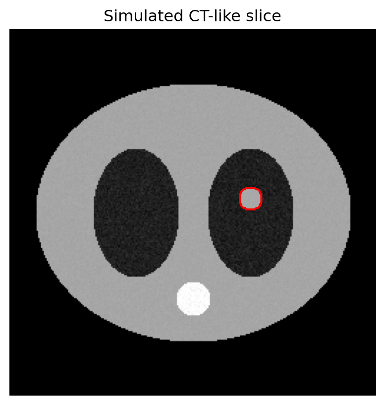
9.1 1. Abstracting away DICOM: what a slice is

A DICOM CT/MR slice, once loaded, is a 2D NumPy array plus metadata such as pixel spacing, orientation, and windowing information. For matplotlib, the slice itself is just an array of shape (H, W).

import matplotlib.pyplot as plt
import numpy as np

def fake_ct_slice(size=256, seed=0):
    """Return a (size, size) array roughly mimicking a CT slice in HU."""
    rng = np.random.default_rng(seed)
    img = np.full((size, size), -1000.0)  # air background

    yy, xx = np.ogrid[:size, :size]

    # Body outline: large soft-tissue ellipse
    body = ((xx - size / 2) / 110) ** 2 + ((yy - size / 2) / 90) ** 2 < 1
    img[body] = 40 + rng.normal(0, 15, body.sum())

    # Lungs: two darker ellipses
    left_lung = ((xx - size / 2 + 40) / 30) ** 2 + ((yy - size / 2) / 45) ** 2 < 1
    right_lung = ((xx - size / 2 - 40) / 30) ** 2 + ((yy - size / 2) / 45) ** 2 < 1
    img[left_lung] = -800 + rng.normal(0, 50, left_lung.sum())
    img[right_lung] = -800 + rng.normal(0, 50, right_lung.sum())

    # Lesion in the right lung
    lesion = ((xx - size / 2 - 40) ** 2 + (yy - size / 2 + 10) ** 2) < 8 ** 2
    img[lesion] = 60 + rng.normal(0, 10, lesion.sum())

    # Spine: posterior midline bone
    spine = (xx - size / 2) ** 2 + (yy - size / 2 - 60) ** 2 < 12 ** 2
    img[spine] = 600 + rng.normal(0, 50, spine.sum())

    return img, lesion

img, lesion_mask = fake_ct_slice()

fig, ax = plt.subplots(figsize=(5, 5))
ax.imshow(img, cmap="gray", vmin=-1000, vmax=600)
ax.contour(lesion_mask, levels=[0.5], colors="red", linewidths=1.5)
ax.set_title("Simulated CT-like slice")
ax.axis("off")
plt.show()

Mock anatomy of the simulated slice:

┌──────────────────────────────────────┐
│ air (-1000)                          │
│   ╭────────────────────────╮         │
│   │ soft tissue (~40 HU)   │         │
│   │   ◯ L lung   R lung ◯  │         │
│   │     (-800)   (-800)    │         │
│   │              ● lesion  │         │
│   │        ⬤ spine (~600)  │         │
│   ╰────────────────────────╯         │
└──────────────────────────────────────┘

For the rest of this module, treat img as a real CT slice and lesion_mask as a ground-truth segmentation.

9.2 2. Pattern 1: display a slice with proper windowing

The most basic radiology figure is a slice shown in a clinical window.

fig, ax = plt.subplots(figsize=(5, 5))
ax.imshow(img, cmap="gray", vmin=-160, vmax=240)  # soft-tissue window
ax.set_title("Soft-tissue window")
ax.axis("off")
plt.show()

Non-negotiables for radiology display:

  • Use cmap="gray" or sometimes "bone" for anatomical display.
  • Set explicit vmin and vmax; auto-windowing makes each slice look different.
  • Use ax.axis("off"); image axes rarely add meaning.
  • Keep square aspect; imshow() preserves it by default.

Window/level conversion:

vmin = level − width/2
vmax = level + width/2

Soft tissue  W=400,  L=40   → vmin=-160,  vmax=240
Lung         W=1500, L=-600 → vmin=-1350, vmax=150
Bone         W=2000, L=300  → vmin=-700,  vmax=1300
Brain        W=80,   L=40   → vmin=0,     vmax=80
Mediastinum  W=350,  L=50   → vmin=-125,  vmax=225

9.3 3. Pattern 2: multi-window comparison

A classic radiology figure shows the same slice in multiple windows.

windows = [
    ("Soft tissue", -160, 240),
    ("Lung", -1350, 150),
    ("Bone", -700, 1300),
]

fig, axes = plt.subplots(1, 3, figsize=(13, 4.5), layout="constrained")

for ax, (name, vmin, vmax) in zip(axes, windows):
    ax.imshow(img, cmap="gray", vmin=vmin, vmax=vmax)
    ax.set_title(f"{name}\n(W={vmax - vmin}, L={(vmax + vmin) / 2:.0f})", fontsize=11)
    ax.axis("off")

fig.suptitle("Same slice, three windows", fontsize=14, fontweight="bold")
plt.show()

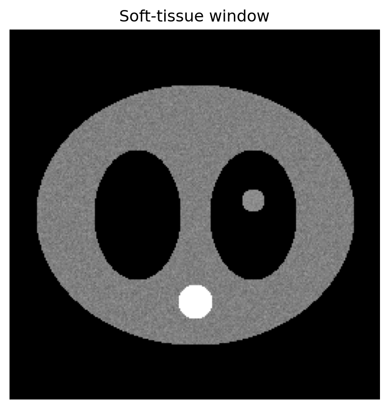
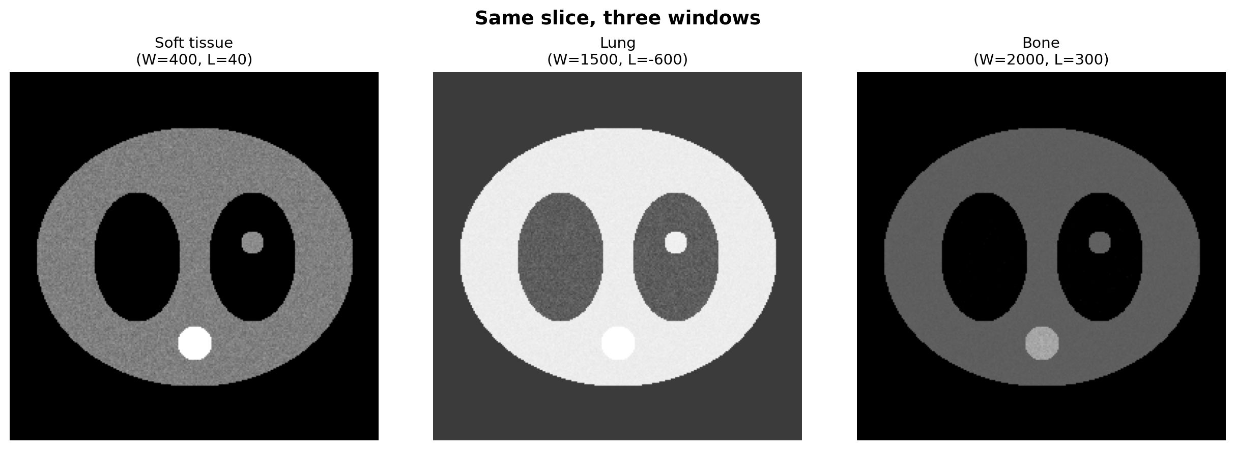
This is the medical imaging equivalent of a faceted comparison plot. The key is that the pixel data are the same while the displayed value range changes.

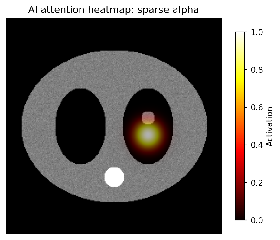
9.4 4. Pattern 3: heatmap overlay

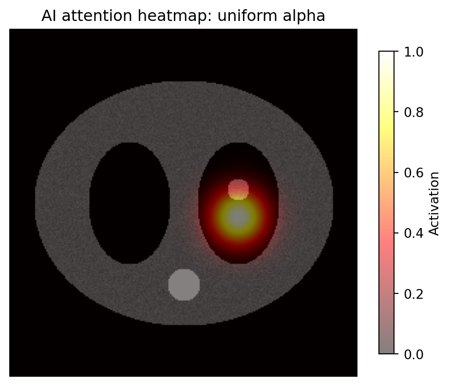
For AI work, a common task is showing where the model is looking. The recipe:

  1. draw the grayscale anatomy first
  2. draw the heatmap on top with alpha
  3. add a colorbar for the heatmap, not the grayscale image
yy, xx = np.indices(img.shape)
heatmap = np.exp(-((xx - 168) ** 2 + (yy - 138) ** 2) / (2 * 15 ** 2))

fig, ax = plt.subplots(figsize=(6, 6))
ax.imshow(img, cmap="gray", vmin=-160, vmax=240)
hm = ax.imshow(heatmap, cmap="hot", alpha=0.5, vmin=0, vmax=1)
ax.set_title("AI attention heatmap: uniform alpha")
ax.axis("off")
fig.colorbar(hm, ax=ax, shrink=0.7, label="Activation")
plt.show()

A scalar alpha=0.5 dims the whole heatmap, including pixels where activation is near zero. That can make the grayscale image look hazy everywhere.

A better pattern is an alpha array: transparent where activation is low, more opaque where activation is high.

alpha_array = np.clip(heatmap * 0.7, 0, 0.7)

fig, ax = plt.subplots(figsize=(6, 6))
ax.imshow(img, cmap="gray", vmin=-160, vmax=240)
hm = ax.imshow(heatmap, cmap="hot", alpha=alpha_array, vmin=0, vmax=1)
ax.set_title("AI attention heatmap: sparse alpha")
ax.axis("off")
fig.colorbar(hm, ax=ax, shrink=0.7, label="Activation")
plt.show()

alpha=0.5 scalar              alpha=array
────────────────              ─────────────────────────
hot  ▓▓▓                       hot  ▓▓▓
warm ▒▒▒  all pixels 50%       warm ▒▒░  partially transparent
cool ░░░  transparent          cool      fully transparent

Sparse-alpha overlays are one of the most important techniques for clean AI/radiology figures.

9.5 5. Pattern 4: segmentation mask overlay

For a binary or label mask, use a colormap with a transparent background.

from matplotlib.colors import ListedColormap

mask_cmap = ListedColormap([
    (0, 0, 0, 0),    # label 0: transparent
    (1, 0, 0, 0.5),  # label 1: semi-transparent red
])

fig, ax = plt.subplots(figsize=(6, 6))
ax.imshow(img, cmap="gray", vmin=-160, vmax=240)
ax.imshow(lesion_mask.astype(int), cmap=mask_cmap, vmin=0, vmax=1)
ax.set_title("Lesion segmentation overlay")
ax.axis("off")
plt.show()

The trick is the custom ListedColormap: label 0 maps to fully transparent RGBA (0, 0, 0, 0), so only the foreground appears.

For multi-class masks, extend the list:

multi_cmap = ListedColormap([
    (0, 0, 0, 0),    # background
    (1, 0, 0, 0.5),  # liver / class 1
    (0, 1, 0, 0.5),  # spleen / class 2
    (0, 0, 1, 0.5),  # kidney / class 3
])

9.6 6. Pattern 5: contour outline of an ROI

Sometimes a filled overlay hides too much anatomy. A contour preserves the base image while showing the boundary.

fig, ax = plt.subplots(figsize=(6, 6))
ax.imshow(img, cmap="gray", vmin=-160, vmax=240)
ax.contour(lesion_mask.astype(int), levels=[0.5], colors="red", linewidths=1.5)
ax.set_title("Lesion contour")
ax.axis("off")
plt.show()

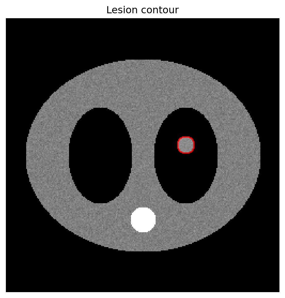
levels=[0.5] finds the boundary where the mask transitions from 0 to 1.

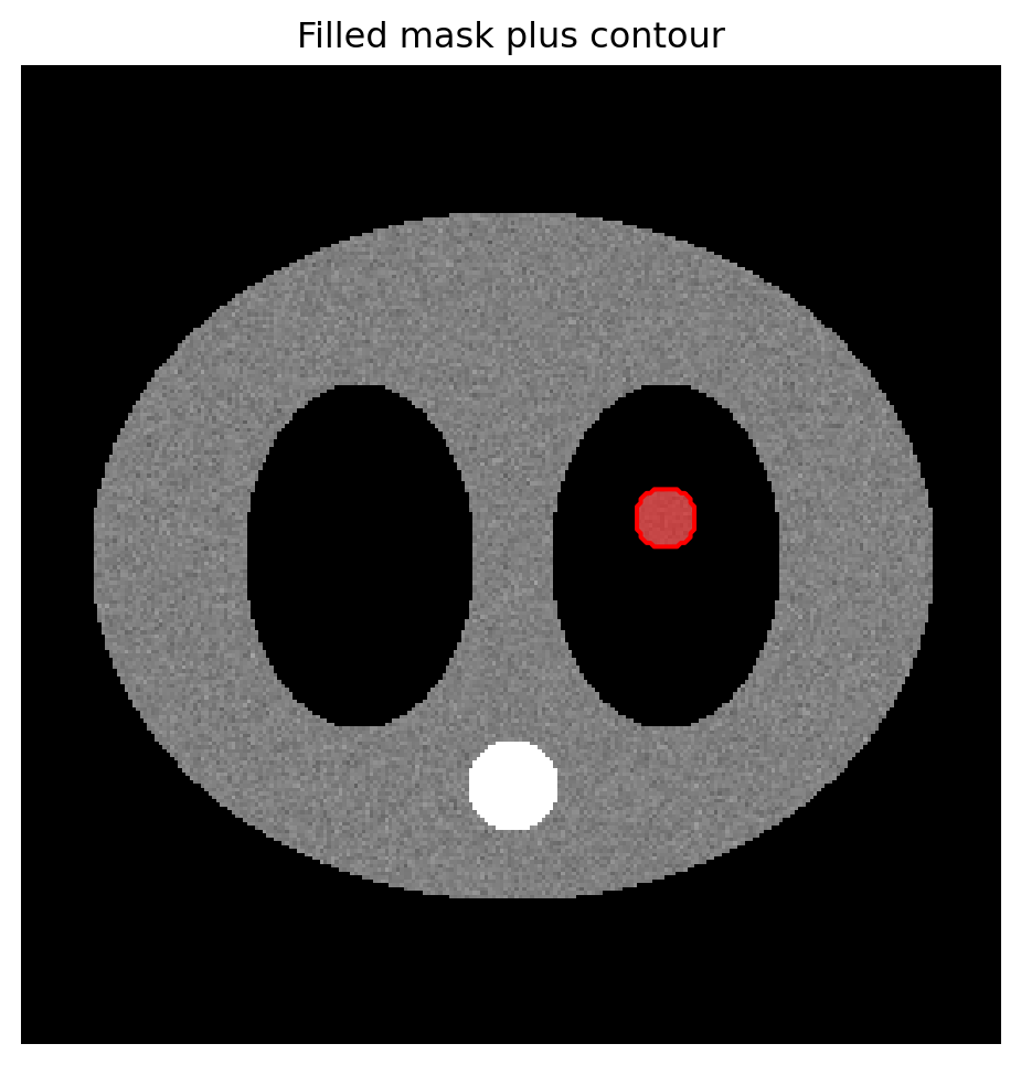
Filled overlay  → emphasize area or probability/density
Contour outline → preserve anatomy and show exact boundary
Both together   → common for agreement or multi-rater figures
fig, ax = plt.subplots(figsize=(6, 6))
ax.imshow(img, cmap="gray", vmin=-160, vmax=240)
ax.imshow(lesion_mask.astype(int), cmap=mask_cmap, vmin=0, vmax=1)
ax.contour(lesion_mask, levels=[0.5], colors="red", linewidths=1.5)
ax.set_title("Filled mask plus contour")
ax.axis("off")
plt.show()

9.7 7. Pattern 6: ground truth vs prediction

This is a staple of AI papers: side-by-side panels with consistent windowing and overlay style.

pred_mask = np.zeros_like(lesion_mask, dtype=bool)
pred_mask[((xx - 170) ** 2 + (yy - 140) ** 2) < 9 ** 2] = True

fig, axes = plt.subplots(1, 3, figsize=(13, 4.5), layout="constrained")

axes[0].imshow(img, cmap="gray", vmin=-160, vmax=240)
axes[0].set_title("Input")
axes[0].axis("off")

axes[1].imshow(img, cmap="gray", vmin=-160, vmax=240)
axes[1].contour(lesion_mask, levels=[0.5], colors="lime", linewidths=1.5)
axes[1].set_title("Ground truth")
axes[1].axis("off")

axes[2].imshow(img, cmap="gray", vmin=-160, vmax=240)
axes[2].contour(lesion_mask, levels=[0.5], colors="lime", linewidths=1.5)
axes[2].contour(pred_mask, levels=[0.5], colors="red", linewidths=1.5, linestyles="--")
axes[2].set_title("Prediction (red) vs GT (green)")
axes[2].axis("off")

plt.show()

Contours do not automatically produce a conventional legend. Use proxy lines.

from matplotlib.lines import Line2D

fig, ax = plt.subplots(figsize=(6, 6))
ax.imshow(img, cmap="gray", vmin=-160, vmax=240)
ax.contour(lesion_mask, levels=[0.5], colors="lime", linewidths=1.5)
ax.contour(pred_mask, levels=[0.5], colors="red", linewidths=1.5, linestyles="--")
ax.axis("off")

legend_elements = [
    Line2D([0], [0], color="lime", lw=1.5, label="Ground truth"),
    Line2D([0], [0], color="red", lw=1.5, ls="--", label="Prediction"),
]
ax.legend(handles=legend_elements, loc="lower right", facecolor="black", labelcolor="white")
plt.show()

9.8 8. Pattern 7: difference image

For per-pixel differences, such as post-pre contrast or prediction-ground truth probability, use a diverging colormap centered on zero.

from matplotlib.colors import TwoSlopeNorm

rng = np.random.default_rng(1)
pred_prob = heatmap + rng.normal(0, 0.05, heatmap.shape)
gt_prob = heatmap
diff = pred_prob - gt_prob

fig, ax = plt.subplots(figsize=(6, 6))
im = ax.imshow(diff, cmap="RdBu_r", norm=TwoSlopeNorm(vcenter=0, vmin=-0.3, vmax=0.3))
ax.set_title("Prediction − ground truth")
ax.axis("off")
fig.colorbar(im, ax=ax, shrink=0.7, label="Δ probability")
plt.show()

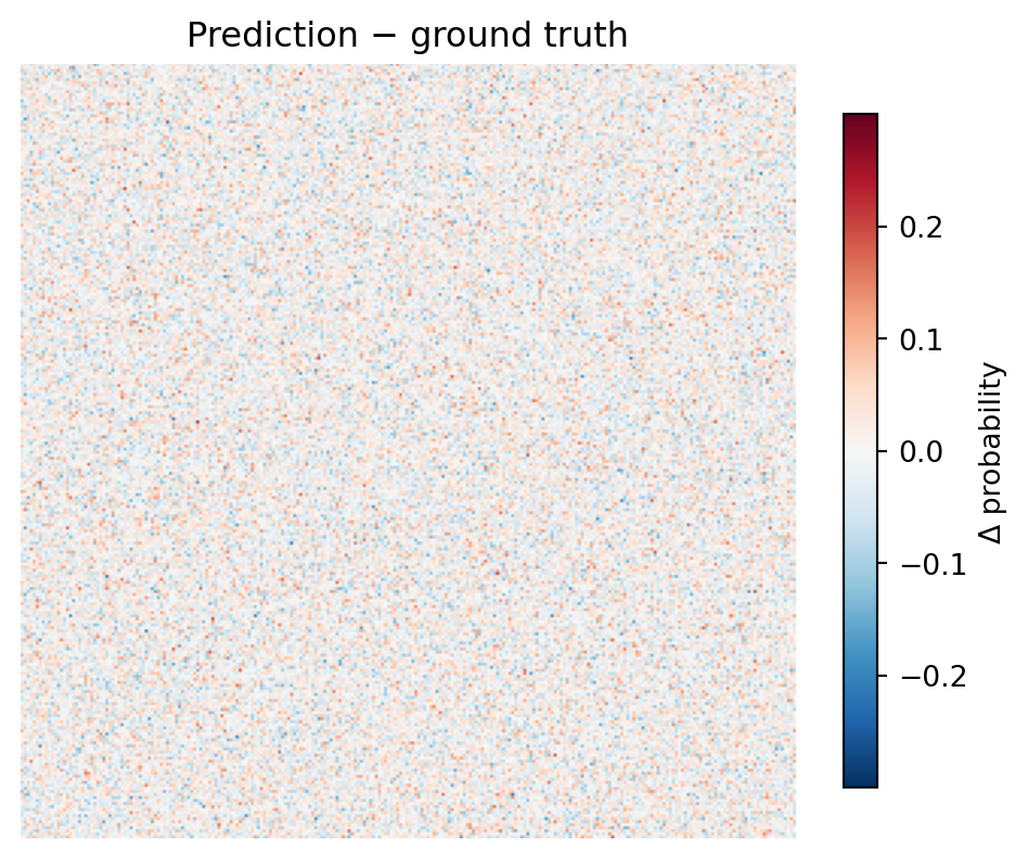
TwoSlopeNorm(vcenter=0) ensures zero lands at the neutral midpoint of the colormap. Without it, zero can be shifted away from white and visually imply a difference where none exists.

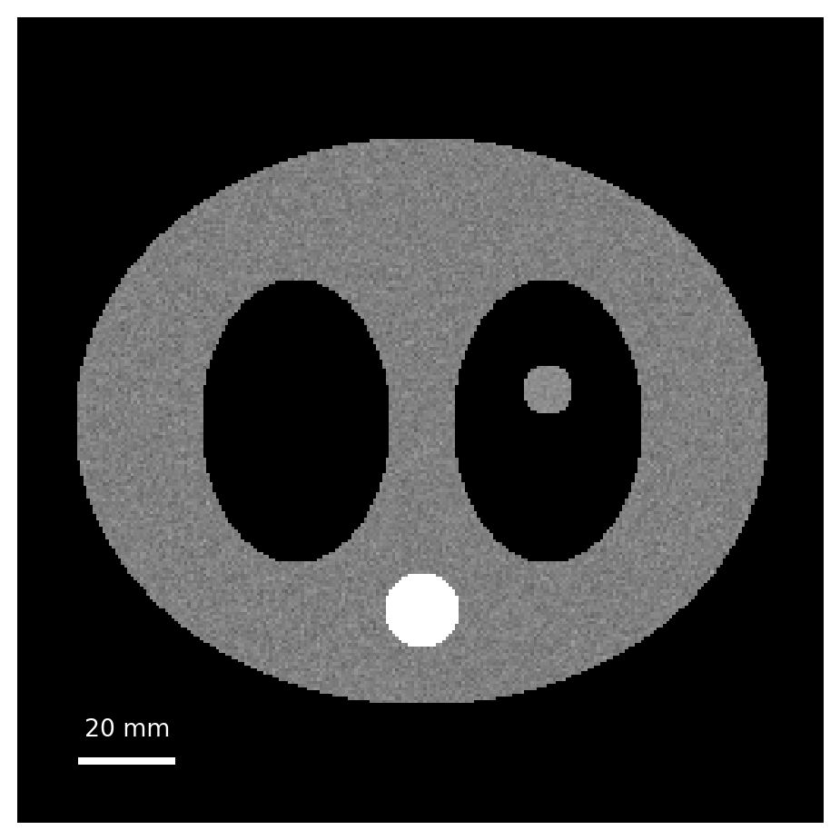
9.9 9. Pattern 8: adding a scalebar

Radiology figures need physical scale. Pixel coordinates are not enough; millimeters matter.

pixel_spacing_mm = 0.7  # from DICOM PixelSpacing in a real case

fig, ax = plt.subplots(figsize=(6, 6))
ax.imshow(img, cmap="gray", vmin=-160, vmax=240)
ax.axis("off")

bar_length_mm = 20
bar_length_px = bar_length_mm / pixel_spacing_mm
y0 = img.shape[0] - 20
x0 = 20

ax.plot([x0, x0 + bar_length_px], [y0, y0], color="white", linewidth=3)
ax.text(x0 + bar_length_px / 2, y0 - 8, f"{bar_length_mm} mm", color="white", ha="center", fontsize=10)
plt.show()

For polished scalebars with units and anchored placement, matplotlib-scalebar is worth installing, but a manual scalebar is often enough for controlled figures.

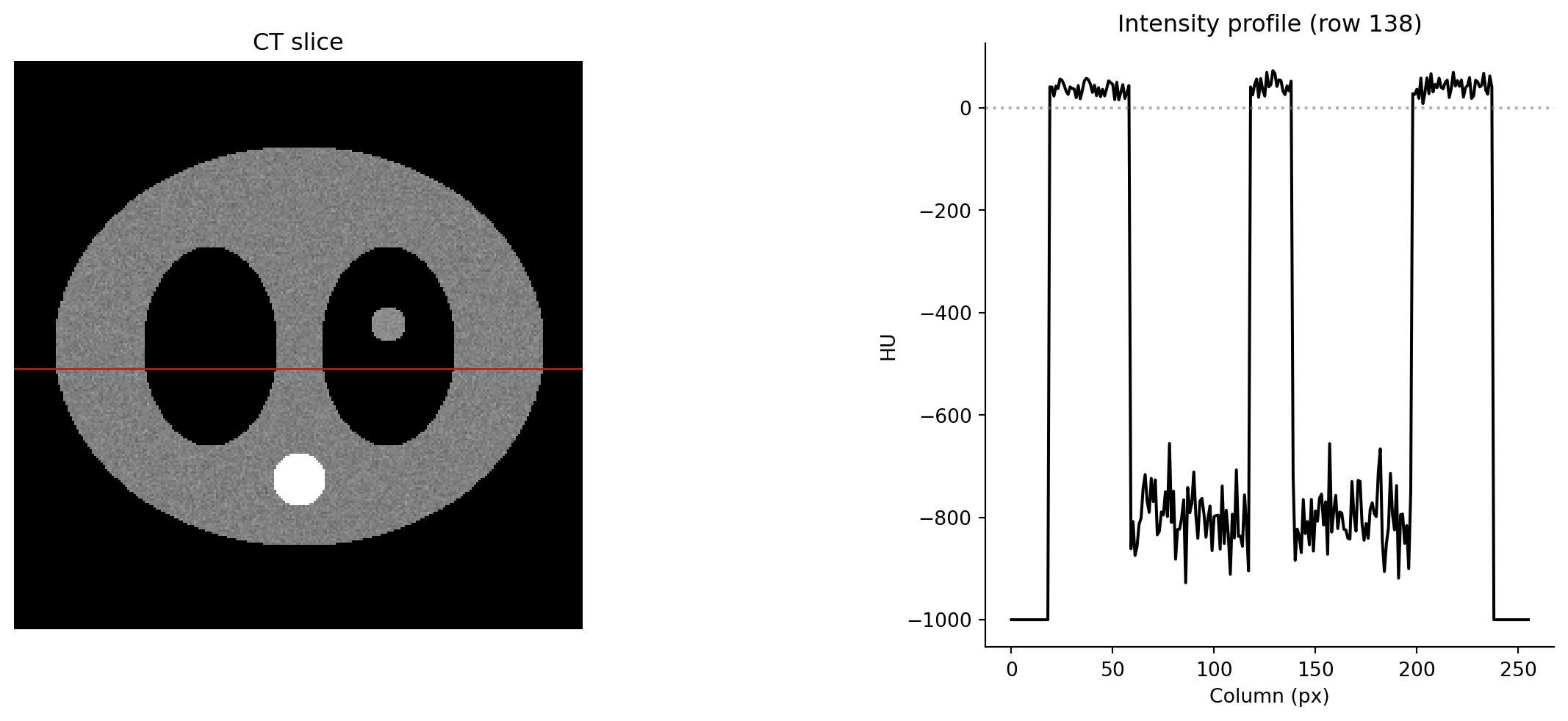
9.10 10. Pattern 9: intensity profile beside the image

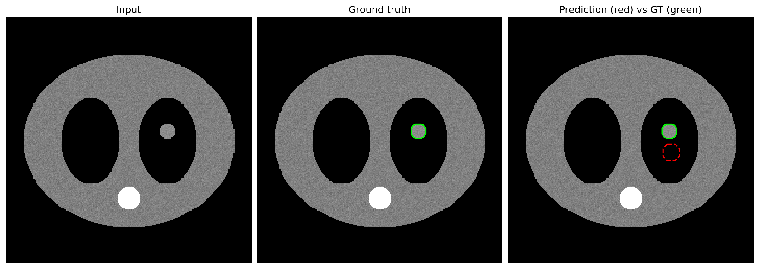
The image plus line-profile figure is a clinical staple. Use a mosaic layout.

fig, axd = plt.subplot_mosaic(
    """
    II.PP
    II.PP
    II.PP
    """,
    figsize=(11, 5),
    layout="constrained",
)

axd["I"].imshow(img, cmap="gray", vmin=-160, vmax=240)
axd["I"].axhline(138, color="red", linewidth=1)
axd["I"].set_title("CT slice")
axd["I"].axis("off")

profile = img[138, :]
axd["P"].plot(profile, color="black")
axd["P"].axhline(0, color="gray", linestyle=":", alpha=0.6)
axd["P"].set_title("Intensity profile (row 138)")
axd["P"].set_xlabel("Column (px)")
axd["P"].set_ylabel("HU")
axd["P"].spines[["top", "right"]].set_visible(False)

plt.show()

ax.axhline() and ax.axvline() draw infinite-extent reference lines. They are useful for marking the profile location on the image.

9.11 11. Putting it together: a publication-style figure

This four-panel figure uses most of the patterns in the module.

fig, axd = plt.subplot_mosaic(
    """
    ABCD
    """,
    figsize=(15, 4.5),
    layout="constrained",
)

# A: input image
axd["A"].imshow(img, cmap="gray", vmin=-160, vmax=240)
axd["A"].set_title("(a) Input")
axd["A"].axis("off")

# B: ground-truth segmentation as filled overlay
axd["B"].imshow(img, cmap="gray", vmin=-160, vmax=240)
axd["B"].imshow(lesion_mask.astype(int), cmap=mask_cmap, vmin=0, vmax=1)
axd["B"].set_title("(b) Ground truth")
axd["B"].axis("off")

# C: AI heatmap with sparse-alpha overlay
axd["C"].imshow(img, cmap="gray", vmin=-160, vmax=240)
hm = axd["C"].imshow(heatmap, cmap="hot", alpha=np.clip(heatmap, 0, 0.7), vmin=0, vmax=1)
axd["C"].set_title("(c) AI attention")
axd["C"].axis("off")

# D: prediction vs GT contours
axd["D"].imshow(img, cmap="gray", vmin=-160, vmax=240)
axd["D"].contour(lesion_mask, levels=[0.5], colors="lime", linewidths=1.5)
axd["D"].contour(pred_mask, levels=[0.5], colors="red", linewidths=1.5, linestyles="--")
axd["D"].set_title("(d) Pred (red) vs GT (green)")
axd["D"].axis("off")

fig.suptitle("Lesion detection — qualitative results", fontsize=14, fontweight="bold")
plt.show()

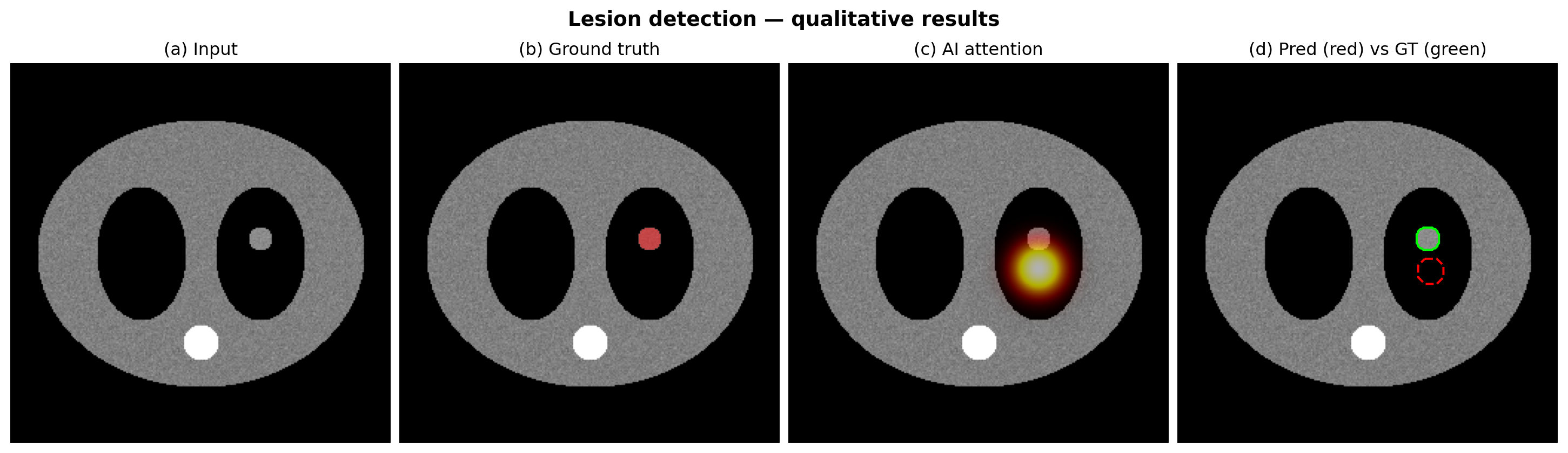
This is the basic shape of many radiology AI qualitative result figures: input, ground truth, heatmap, and prediction comparison.

9.12 Summary cheat sheet

Need Tool
Display anatomy imshow(..., cmap="gray", vmin=, vmax=)
Hide axes ax.axis("off")
Heatmap overlay, uniform alpha imshow(..., cmap="hot", alpha=0.5)
Heatmap overlay, sparse alpha imshow(..., alpha=clipped_array)
Mask overlay with transparent background ListedColormap with (0,0,0,0) for label 0
ROI outline ax.contour(mask, levels=[0.5])
Difference image cmap="RdBu_r" + TwoSlopeNorm(vcenter=0)
Reference line on image ax.axhline() / ax.axvline()
Multi-window panel subplots(1, n) loop over (vmin, vmax)
Image plus side panel subplot_mosaic("II.P / II.P")
Physical scale manual scalebar or matplotlib-scalebar

9.13 Exercises

9.13.1 Exercise 1: windowing

Generate img, lesion_mask = fake_ct_slice(). Build a 1×4 figure showing the same slice in lung, soft-tissue, bone, and brain windows. Title each panel with the window name and (W, L) values. Use layout="constrained".

9.13.2 Exercise 2: sparse-alpha heatmap

Generate the Gaussian heatmap from section 4. Make a 1×2 figure: left panel uses uniform alpha=0.5; right panel uses an alpha array equal to the heatmap itself. Compare how anatomy is preserved in low-activation regions.

9.13.3 Exercise 3: multi-class mask

Build a fake 3-class label map: background 0, lesion core 1 as an inner circle, and lesion edema 2 as a ring around it. Display it overlaid on the CT slice using ListedColormap with transparent background, semi-transparent red for label 1, and semi-transparent yellow for label 2. Add a manual legend.

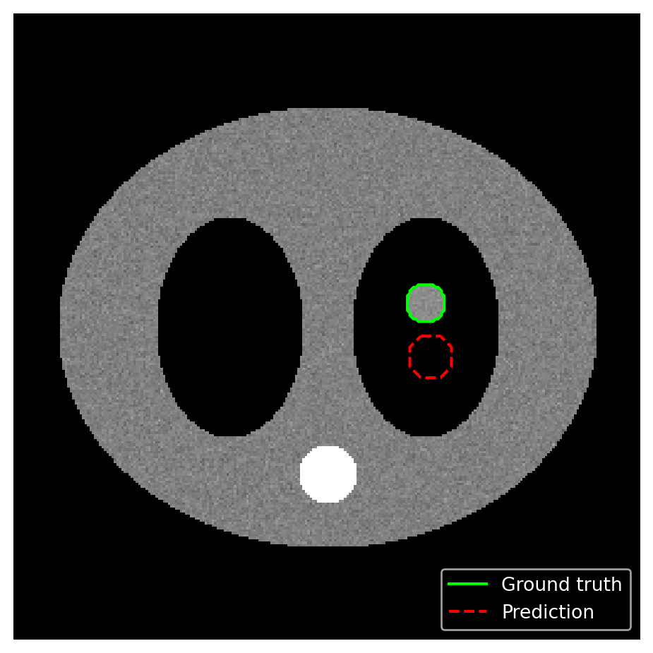
9.13.4 Exercise 4: GT vs prediction

Using lesion_mask as ground truth and a hand-crafted pred_mask, make a single panel showing both as contours: GT in green solid, prediction in red dashed. Add a proxy-line legend.

9.13.5 Exercise 5: difference image

Compute diff = pred_prob - gt_prob from two slightly different Gaussian heatmaps. Display it with cmap="RdBu_r" and TwoSlopeNorm(vcenter=0). Add a colorbar labeled "Δ probability". Verify visually that zero is exactly white.

9.13.6 Exercise 6: publication-quality dashboard

Reproduce the four-panel figure from section 11 while applying the radai.mplstyle from Module 7. Save it with:

fig.savefig("lesion_detection.png", dpi=300, bbox_inches="tight")

This bridges directly into publication/export workflows.